
Overview
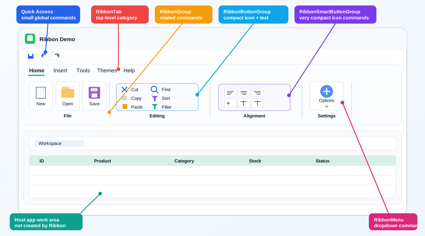
Ribbon UI is not a single control. In jdashboardUI it is a complete family of classes that work together to build a Microsoft Office-style interface in B4J.
The real structure is:
Ribbon
├── Quick Access Bar
├── RibbonTab
│   ├── RibbonGroup
│   │   ├── large buttons
│   │   ├── RibbonMenu
│   │   ├── RibbonButtonGroup
│   │   └── RibbonSmartButtonGroup
│   └── more RibbonGroup...
└── more RibbonTab...
There are also RibbonQuickAccess, for advanced access to the native Quick Access Bar, and GradientPanel, an optional visual helper. GradientPanel is not a required Ribbon dependency.
The supplied Ribbon UI Studio, FirmaDoc Pro and data-application screenshots are used only as usage references. This page documents the actual source implementation.
What belongs to Ribbon and what does not
Ribbon manages tabs, groups, buttons, compact button groups, menus, submenus, Quick Access, themes, colors, fonts and tab events.
The window title bar, application name, minimize / maximize / close controls, data grid, code editor, PDF viewer and status bar belong to the host application. Ribbon does not create those automatically.
Ribbon UI modules
| Module | Purpose |
|---|---|
| Ribbon | Main control, tabs, Quick Access, themes and global styles |
| RibbonTab | A tab such as Home, Tools or Help |
| RibbonGroup | Large group inside a tab |
| RibbonButtonGroup | Compact icon + text command group |
| RibbonSmartButtonGroup | Compact group, normally icon-only |
| RibbonMenu | Menus, checks, radio items, titles, custom panels and submenus |
| RibbonQuickAccess | Advanced wrapper for the Java QuickAccessBar |
| GradientPanel | Optional gradient background helper |
Main Java dependency
The source project declares:
#AdditionalJar: fxribbon-1.2.2.jar
The implementation creates these Java classes directly:
com.pixelduke.control.Ribbon
com.pixelduke.control.ribbon.RibbonTab
com.pixelduke.control.ribbon.RibbonGroup
com.pixelduke.control.ribbon.QuickAccessBar
When compiling from source, fxribbon-1.2.2.jar must be available.
B4J libraries used
The implementation mainly uses jFX, XUI / jXUI, JavaObject, jReflection, CSSUtils, jdashboardUtils and JImageView.
Normal application code does not need to manipulate JavaObject or Reflector directly because the Ribbon classes wrap those calls.
How Ribbon is actually used
Use the root Ribbon from the Designer
Ribbon implements DesignerCreateView and is intended to be added as a Custom View.
Unlike several other jdashboardUI controls, the root Ribbon does not expose a public AddToParent method.
The normal pattern is:
- Add Ribbon to a B4J layout.
- Load the layout.
- Create RibbonTab instances in code.
- Create RibbonGroup instances.
- Add buttons, compact groups or RibbonMenu objects.
- Add groups to each tab.
- Add tabs to Ribbon.
Minimal complete example
Assume the Designer Custom View is named Ribbon1.
Sub Class_Globals
    Private fx As JFX
    Private xui As XUI
    Private Ribbon1 As Ribbon
End Sub

Private Sub BuildRibbon
    Dim HomeTab As RibbonTab
    HomeTab.Initialize(Me, "HomeTab", "Home")

    Dim FileGroup As RibbonGroup
    FileGroup.Initialize(Me, "File")

    FileGroup.AddButtonImage( _
        "OpenFile", _
        File.DirAssets, _
        "open.png", _
        "Open File", _
        "Open an existing document")

    FileGroup.AddButtonIcon( _
        "SaveFile", _
        fx.CreateFontAwesome(34), _
        Chr(0xF0C7), _
        xui.Color_RGB(40, 120, 220), _
        "Save", _
        "Save the current document")

    HomeTab.addGroup(FileGroup)
    Ribbon1.AddTab(HomeTab)
End Sub

Private Sub OpenFile_Click
    Log("Open")
End Sub

Private Sub SaveFile_Click
    Log("Save")
End Sub
The EventName passed to a button maps directly to its callback Sub:
EventName = OpenFile
event = OpenFile_Click
Real implementation — Ribbon UI Studio / Office Editor
The clearest way to understand Ribbon is to see it used inside a large application. Ribbon UI Studio / Office Editor uses RibbonTab, RibbonGroup, RibbonButtonGroup, RibbonSmartButtonGroup, RibbonMenu, nested submenus, Quick Access, localization, contextual states and Pro-only commands at the same time.
Real Designer configuration
Ribbon1 is placed in Layout1 as a Custom View with approximately:
Stylebar        = GlassMinimal
BackgroundColor = 0xEB15171B
GroupTextColor  = 0xFFE5E5E5
SelectionColor  = 0xFF448FB3
SeparatorColor  = 0xFF454547
TapTextColor    = 0xFFB3B7D5
Height          = 220
Horizontal      = full width
The work area is positioned below Ribbon:
MonacoEditorView1.Top = Ribbon1.Bottom + 10
MonacoEditorView1.Height = 100%y - Ribbon1.Height - 45dip
This is a realistic desktop pattern: Ribbon is a fixed top structure and the editor fills the remaining space.
Actual application hierarchy
Home
├── File
│   ├── Open
│   ├── New Add-in ▼
│   ├── Save
│   ├── Save As
│   ├── Package
│   └── Close document
└── Icons

Tools
├── XML Tools
├── Review Ribbon
│   ├── RibbonButtonGroup
│   └── Format
├── Module Management
│   ├── RibbonButtonGroup
│   └── large commands
└── Editing
    ├── RibbonSmartButtonGroup
    └── large commands

License         ← Pro only
Examples
Help
Rebuilding the full Ribbon
The real application starts Ribbon_start by removing the previous structure:
Sub Ribbon_start
    Ribbon1.RemoveAllTabs
    Ribbon1.RemoveAllQuickAccessButtons

    ' rebuild tabs, groups, menus and Quick Access
End Sub
This is used when language or license state changes.
After a Pro activation:
Sub GestorLicencia_ActivationSuccess(Result As LicenseResult)
    ValidarNivelLicenciaOfficeEditor
    Ribbon_start

    ActualizarBotonesArchivo(mFileManager.IsOpen)

    Dim isXml As Boolean = mEditorMode <> "vba"
    ActualizarBotonesHerramientas( _
        mFileManager.IsOpen And isXml, _
        isXml)
End Sub
Localized tabs, groups, captions and tooltips
tapInicio.Initialize( _
    Me, _
    "", _
    loc.LocalizeTag("tab_home", "Inicio"))

grpArchivo.Initialize( _
    Me, _
    loc.LocalizeTag("grp_file", "Archivo"))

grpArchivo.AddButtonIcon( _
    "btnOpen", _
    iconfont.IconFontAwesomeRegular, _
    Chr(0xf07c), _
    xui.Color_RGB(255, 170, 0), _
    loc.LocalizeTag("btn_open", "Abrir"), _
    loc.LocalizeTag("tooltip_open", "Abre un archivo de Office"))
When the language changes, the locale is changed and Ribbon_start is called again. This avoids manually editing every visible caption.
Real large RibbonGroup commands
grpArchivo.AddButtonIcon( _
    "btnSave", _
    iconfont.IconFontAwesomeSolid, _
    Chr(0xf0c7), _
    xui.Color_RGB(16, 185, 129), _
    "Save", _
    "Save changes")
An image can also be used:
grpHerramientas.AddButtonImage( _
    "btnGenerarCallbacks", _
    File.DirAssets, _
    "file-type-vba@48px.png", _
    "Generate callbacks", _
    "Create required Ribbon macros")
These are primary, visually large commands.
Real large RibbonMenu
Dim menuAddin As RibbonMenu
menuAddin.Initialize(Me, "menuAddin")
menuAddin.InitializeGroup("New Add-in")

menuAddin.CreateWithImage( _
    File.DirAssets, _
    "addin-office@48px.png", _
    "New Add-in")

grpArchivo.AddRibbonMenu(menuAddin)
A large RibbonMenu occupies the same visual level as a primary button while opening additional choices.
Real nested submenus
Dim menuExcel As JavaObject = menuAddin.AddSubMenu( _
    "subExcelAddin", _
    "Excel (.xlam)", _
    Chr(0xf1c3), _
    iconfont.IconFontAwesomeSolid, _
    xui.Color_RGB(35, 114, 41))

menuAddin.AddItemToSubMenu( _
    menuExcel, _
    "btnCrearExcelAddinModern", _
    "Modern Office (2010+)", _
    Chr(0xf109), _
    iconfont.IconFontAwesomeSolid, _
    xui.Color_RGB(35, 114, 41))
The application creates separate Excel, Word and PowerPoint submenus.
Real RibbonButtonGroup
subgrpRevision.Initialize(Me, "subgrpRevision")

subgrpRevision.AddButtonIcon( _
    "btnPreviewRibbon", _
    iconfont.IconFontAwesomeSolid, _
    Chr(0xf06e), _
    fx.Colors.RGB(100, 150, 255), _
    "Visual designer", _
    "Design the Ribbon visually")

subgrpRevision.AddButtonIcon( _
    "btnInspectRibbon", _
    iconfont.IconFontAwesomeSolid, _
    Chr(0xf0f3), _
    fx.Colors.RGB(255, 170, 0), _
    "Diagnostics", _
    "Check callbacks, IDs and icons")

subgrpRevision.AddButtonImage( _
    "btnValidate", _
    File.DirAssets, _
    "file-xml@48px.png", _
    "Validate XML", _
    "Check syntax")

grpRevision.addButtonGroup(subgrpRevision)
This is a real three-row compact command group.
Real RibbonSmartButtonGroup
Copy, Cut and Paste use an even more compact group:
subgrpEditar.Initialize(Me, "subgrpEditar")

subgrpEditar.AddButtonIcon( _
    "btnEditCopy", _
    iconfont.IconFontAwesomeSolid, _
    Chr(0xf0c5), _
    fx.Colors.RGB(96, 165, 250), _
    "Copy selected text")

subgrpEditar.AddButtonIcon( _
    "btnEditCut", _
    iconfont.IconFontAwesomeSolid, _
    Chr(0xf0c4), _
    fx.Colors.RGB(248, 113, 113), _
    "Cut selected text")

subgrpEditar.AddButtonIcon( _
    "btnEditPaste", _
    iconfont.IconFontAwesomeSolid, _
    Chr(0xf0ea), _
    fx.Colors.RGB(74, 222, 128), _
    "Paste clipboard text")

grpEditar.addSmartButtonGroup(subgrpEditar)
Here the final text is used as a tooltip and the icon is the primary visual element.
Practical size comparison
| Control | Real use |
|---|---|
| RibbonGroup.AddButtonIcon / AddButtonImage | Large primary command |
| RibbonMenu.InitializeGroup | Large primary dropdown command |
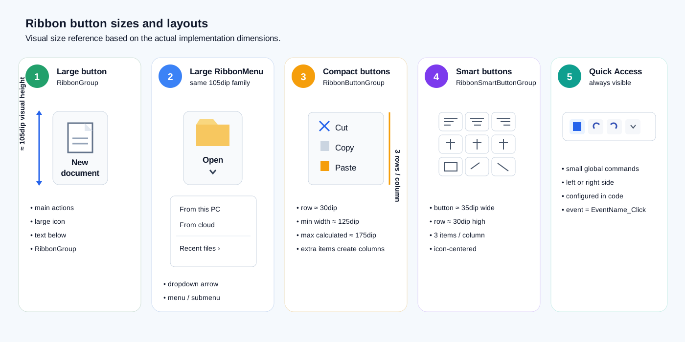
| RibbonButtonGroup | Three compact icon/image + text commands |
| RibbonSmartButtonGroup | Three very compact icon-driven commands |
| Quick Access | Small always-available commands |
Keep the returned Button reference
mPackagingButton = grpArchivo.AddButtonIcon( _
    "btnCreateInstaller", _
    iconfont.IconFontAwesomeSolid, _
    Chr(0xf019), _
    xui.Color_RGB(137, 180, 250), _
    "Package", _
    "Create an .exe installer")
The returned Button can later be controlled directly through Enabled, Visible and JavaFX Managed.
Context-aware Enabled state
grpArchivo.SetButtonEnabled("btnSaveAs", Habilitado)

subgrpRevision.SetButtonEnabled( _
    "btnValidate", _
    Habilitado And IsXml)

grpRevision.SetButtonEnabled( _
    "btnFormat", _
    Habilitado And IsXml)
This allows the Ribbon to follow document and editor state.
Hide without leaving empty layout space
The application combines Visible and JavaFX Managed:
Private Sub SetRibbonButtonVisibility( _
    b As Button, _
    Visible As Boolean)

    If b.IsInitialized = False Then Return

    b.Visible = Visible

    Dim node As JavaObject = b
    node.RunMethod("setManaged", Array(Visible))
End Sub
Recommended contextual hiding:
Visible = False
Managed = False
The remaining Ribbon controls can then reclaim the space.
Conditional items and tabs
A Pro-only item is created only when appropriate:
If IsOfficeEditorPro Then
    menuNewRibbon.AddItemToSubMenu( _
        subTemplates, _
        "btnTemplateLicense", _
        "Licensed Add-in", _
        Chr(0xf084), _
        iconfont.IconFontAwesomeSolid, _
        xui.Color_RGB(255, 170, 0))
End If
A complete tab can also be conditional:
Ribbon1.addTab(tapInicio)
Ribbon1.addTab(tapDesarrollo)

If IsOfficeEditorPro Then
    Ribbon1.addTab(tapSeguridad)
End If

Ribbon1.addTab(tapEjemplos)
Ribbon1.addTab(tapAyuda)
Quick Access reuses the same EventName
Ribbon1.AddQuickAccessButtonIcon( _
    "btnOpen", _
    iconfont.IconFontAwesomeRegular, _
    Chr(0xf07c), _
    xui.Color_RGB(255, 170, 0), _
    "Open")

Ribbon1.AddQuickAccessButtonIcon( _
    "btnSave", _
    iconfont.IconFontAwesomeSolid, _
    Chr(0xf0c7), _
    xui.Color_RGB(16, 185, 129), _
    "Save")
The large command and Quick Access command can use the same EventName, so both execute the same btnOpen_Click or btnSave_Click callback.
Quick Access can also be contextual
mDesignerQuickButton = _
    Ribbon1.AddQuickAccessButtonIcon( _
        "btnPreviewRibbon", _
        iconfont.IconFontAwesomeSolid, _
        Chr(0xf06e), _
        xui.Color_RGB(100, 150, 255), _
        "Visual designer")
The application later changes Visible, Enabled and Managed according to whether a document is open.
Global custom font
Ribbon1.UpdateAllRibbonFonts( _
    fx.LoadFont( _
        File.DirAssets, _
        "righteous-regular.ttf", _
        12))
Applying the font after construction updates newly created controls too.
Contextual Office accent
The application changes Ribbon accent according to the host document:
no document → purple
Word        → blue
PowerPoint  → orange
Excel       → green
It uses:
Ribbon1.SetSelectColor(accent)
The host application also updates its title bar, background and status bar so Ribbon participates in one coordinated theme.
Production flow
Designer
   ↓
Ribbon_start
   ↓
create tabs
   ↓
create groups
   ↓
add buttons / menus / compact groups
   ↓
add tabs to Ribbon
   ↓
apply global font
   ↓
create Quick Access
   ↓
update Enabled / Visible / Managed
This is a production-style implementation of Ribbon rather than a minimal isolated sample.
Ribbon — root control
Initialization and global events
When Ribbon is used from the Designer, B4J calls Initialize(Callback, EventName). The Custom View event name is used for global events such as:
Ribbon1_TabChanged
Ribbon1_TabThemeChanged
Designer properties
| Property | Default | Purpose |
|---|---|---|
| Stylebar | Office2007 | Initial CSS theme |
| BackgroundColor | 0xFFEFEFEF | Group background |
| SelectionColor | 0xFF7866E1 | Selection / accent color |
| TapTextColor | 0xFF4b4b4b | Tab text color |
| GroupTextColor | 0xFF34373E | Group title color |
| ButtonTextColor | 0xFF1C1C1C | Control text color |
| SeparatorColor | 0xFFD3D3D3 | Separator color |
The actual source property is named TapTextColor.
Built-in themes
Theme accepts these exact names:
Office2007
Office2019
Office2021
Modern
FluentFusion
NeonTheme
FluentDesing
FlatRibbon
GlassMinimal
MidnightGlass
NordicLight
Aurora
Example:
Ribbon1.Theme = Ribbon1.ThemeOffice2021
or:
Ribbon1.Theme = "Office2021"
Read the active theme:
Log(Ribbon1.CurrentTheme)
Runtime color customization
Ribbon1.ColorGroup = xui.Color_RGB(245, 245, 245)
Ribbon1.TitleGroupColor = xui.Color_DarkGray
Ribbon1.ColorLabelControls = xui.Color_Black
Ribbon1.SelectColor = xui.Color_RGB(35, 170, 110)
Ribbon1.TitleTapColor = xui.Color_DarkGray
Ribbon1.SeparatorColor = xui.Color_LightGray
Each setter refreshes the Ribbon style.
Update all fonts
Dim AppFont As B4XFont = xui.CreateDefaultFont(13)
Ribbon1.UpdateAllRibbonFonts(AppFont)
The update traverses registered tabs, groups, RibbonButtonGroup objects and RibbonMenu objects.
Ribbon events
TabChanged
Private Sub Ribbon1_TabChanged(Index As Int, TabName As String)
    Log("Tab: " & Index & " - " & TabName)
End Sub
The implementation returns a 1-based tab index.
TabThemeChanged
Private Sub Ribbon1_TabThemeChanged(ThemeName As String)
    Log("Theme: " & ThemeName)
End Sub
This event is raised by the built-in theme button handlers.
RibbonTab
RibbonTab represents a top-level tab such as Home, Database, Themes, Tools, License or Help.
Create a tab
Dim ToolsTab As RibbonTab
ToolsTab.Initialize(Me, "ToolsTab", "Tools")
Ribbon1.AddTab(ToolsTab)
Actual signature:
Initialize(Callback As Object, EventName As String, Title As String) As RibbonTab
The EventName is stored, although the current implementation does not expose its own public RibbonTab events.
Add a group
Dim ToolsGroup As RibbonGroup
ToolsGroup.Initialize(Me, "Tools")
ToolsTab.addGroup(ToolsGroup)
Font icon on a tab
ToolsTab.SetTabIcon( _
    fx.CreateFontAwesome(18), _
    Chr(0xF0AD), _
    xui.Color_RGB(60, 120, 220))
Image on a tab
ToolsTab.SetTabImage(File.DirAssets, "tools.png")
The implementation creates a 20 x 20 JImageView.
Tab background
ToolsTab.BackgroundColor(fx.Colors.White)
Get registered groups
Dim Groups As List = ToolsTab.GetGroupsList
Advanced access
Dim NativeTab As JavaObject = ToolsTab.AsJO
Dim TabNode As Node = ToolsTab.AsNode
Dim BasePane As Pane = ToolsTab.GetBase
Dim RootSplit As SplitPane = ToolsTab.SplitPane
RibbonTab also exposes SetDefaultUserAgentStylesheet and IsMenuButton(View).
RibbonGroup
RibbonGroup is the visual section inside a tab, for example File, Clipboard, Editing, Tools, PDF, Images or Alignment.
Create
Dim FileGroup As RibbonGroup
FileGroup.Initialize(Me, "File")
HomeTab.addGroup(FileGroup)
Actual signature:
Initialize(Callback As Object, Title As String) As RibbonGroup
The second parameter is the group title, not an EventName.
Large image button
FileGroup.AddButtonImage( _
    "OpenFile", _
    File.DirAssets, _
    "open.png", _
    "Open File", _
    "Open an existing file")
Actual signature:
AddButtonImage(EventName, ImageDir, ImageName, ButtonText = "", Tooltip = "") As Button
Large buttons share a visual height of 105dip. The image layout is normalized to roughly 38dip.
Large font-icon button
FileGroup.AddButtonIcon( _
    "SaveFile", _
    fx.CreateFontAwesome(34), _
    Chr(0xF0C7), _
    xui.Color_RGB(40, 120, 220), _
    "Save", _
    "Save changes")
Event:
Private Sub SaveFile_Click
End Sub
Change group title
FileGroup.addTitle("Document")
Group title icon
FileGroup.SetGroupIcon( _
    fx.CreateFontAwesome(16), _
    Chr(0xF07C), _
    xui.Color_RGB(245, 170, 20))
Group title image
FileGroup.SetGroupImage(File.DirAssets, "folder.png")
Important
SetGroupIcon and SetGroupImage look up the internal Label created by the JavaFX skin. If the skin is not ready, the source waits 100 ms and tries again. Prefer calling these methods after the Ribbon is on the scene or after the form is shown.
Local colors
FileGroup.TitlesColor(fx.Colors.Blue)
FileGroup.ColorLabelcontrol(fx.Colors.DarkGray)
FileGroup.BackgroundColor(fx.Colors.White)
Get a button
Dim SaveButton As Button = FileGroup.GetButton("SaveFile")
If SaveButton.IsInitialized Then SaveButton.Text = "Save now"
Enabled / Visible
FileGroup.SetButtonEnabled("SaveFile", False)
FileGroup.SetButtonVisible("SaveFile", False)
Add a custom view
FileGroup.addView(MyCustomView)
AddToParent
RibbonGroup does expose:
FileGroup.AddToParent(ParentPane, 0, 0, 300dip, 120dip)
For normal Ribbon usage, Tab.addGroup(Group) is the recommended path.
Advanced access
Dim NativeGroup As JavaObject = FileGroup.AsJO
Dim NodeGroup As Node = FileGroup.AsNode
Dim BaseGroup As Pane = FileGroup.GetBase
Dim RootSplit As SplitPane = FileGroup.SplitPane
Dim Count As Int = FileGroup.NodeCount
RibbonButtonGroup
RibbonButtonGroup is designed for compact icon + text commands such as Cut, Copy, Paste Special or editing commands.
The implementation arranges three items per column and starts another column when more than three are added.
Create
Dim ClipboardButtons As RibbonButtonGroup
ClipboardButtons.Initialize(Me, "ClipboardButtons")

ClipboardButtons.AddButtonIcon( _
    "Cut", _
    fx.CreateFontAwesome(21), _
    Chr(0xF0C4), _
    fx.Colors.Blue, _
    "Cut", _
    "Cut selected content")

ClipboardButtons.AddButtonIcon( _
    "Copy", _
    fx.CreateFontAwesome(21), _
    Chr(0xF0C5), _
    fx.Colors.Gray, _
    "Copy", _
    "Copy selected content")

ClipboardGroup.addButtonGroup(ClipboardButtons)
Image button
ClipboardButtons.AddButtonImage( _
    "Paste", _
    File.DirAssets, _
    "paste.png", _
    "Paste", _
    "Paste content")
Actual layout behavior
- row height: 30dip;
- 3 rows per column;
- approximate minimum column width: 125dip;
- width is calculated from the caption;
- maximum calculated column width: 175dip;
- extra items create additional columns.
Get / disable
Dim B As Button = ClipboardButtons.GetButton("Copy")
ClipboardButtons.SetButtonEnabled("Copy", False)
Font
ClipboardButtons.UpdateFont(xui.CreateDefaultFont(12))
RibbonSmartButtonGroup
RibbonSmartButtonGroup is the most compact layout. It is intended mainly for small centered icon commands.
Create
Dim AlignButtons As RibbonSmartButtonGroup
AlignButtons.Initialize(Me, "AlignButtons")

AlignButtons.AddButtonIcon( _
    "AlignLeft", _
    fx.CreateFontAwesome(20), _
    Chr(0xF036), _
    fx.Colors.DarkGray, _
    "Align left")

AlignButtons.AddButtonIcon( _
    "AlignCenter", _
    fx.CreateFontAwesome(20), _
    Chr(0xF037), _
    fx.Colors.DarkGray, _
    "Align center")

AlignmentGroup.addSmartButtonGroup(AlignButtons)
Image button
AlignButtons.AddButtonImage( _
    "Grid", _
    File.DirAssets, _
    "grid.png", _
    "Grid view")
Actual layout
- about 35dip per button;
- 30dip height;
- 3 items per column;
- a new column is created every three items;
- each new column advances by 40dip.
State
AlignButtons.SetButtonEnabled("Grid", False)
Dim GridButton As Button = AlignButtons.GetButton("Grid")
RibbonMenu
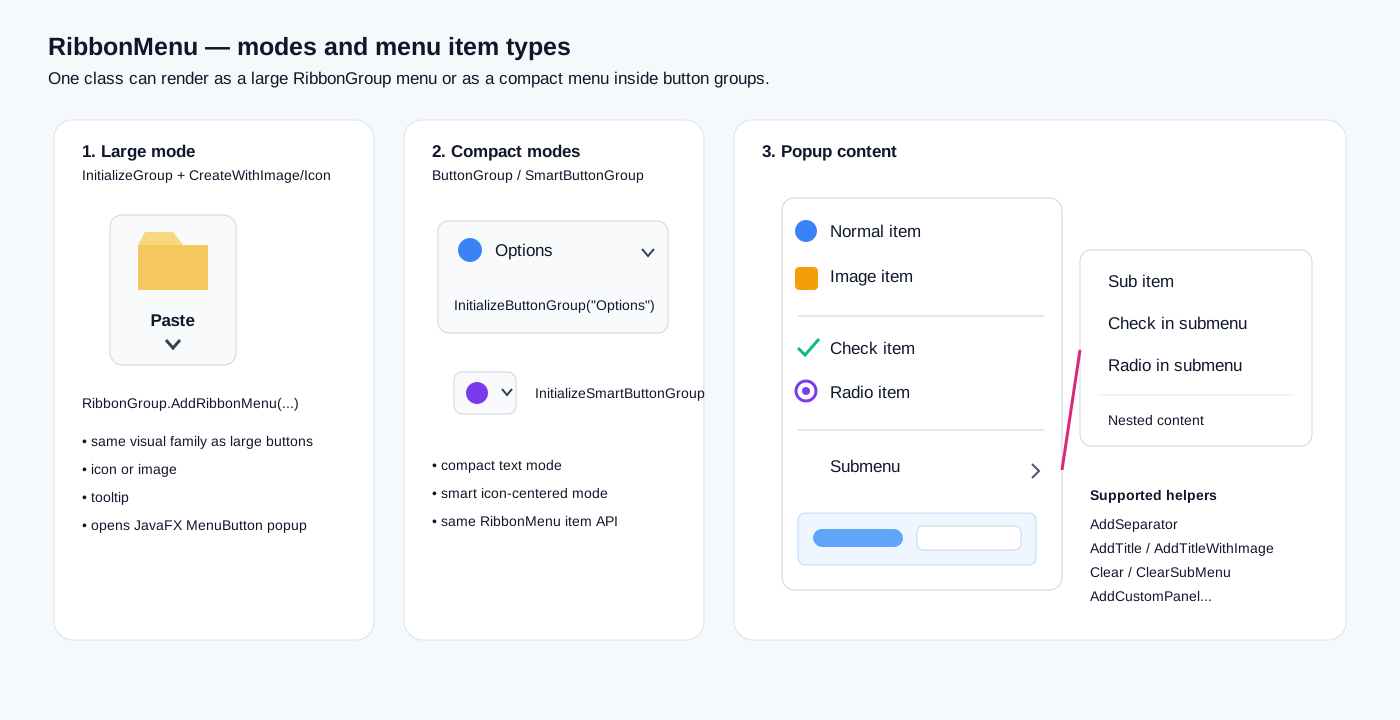
RibbonMenu creates a JavaFX MenuButton adapted for Ribbon.
It supports three modes:
- large RibbonGroup menu;
- compact RibbonButtonGroup menu;
- compact RibbonSmartButtonGroup menu.
Base initialization
Dim PasteMenu As RibbonMenu
PasteMenu.Initialize(Me, "PasteMenu")
The object EventName is stored, while menu item callbacks are resolved through each item's individual EventName.
Large RibbonMenu
PasteMenu.InitializeGroup("Paste")
Create with icon
PasteMenu.CreateWithIcon( _
    Chr(0xF0EA), _
    fx.CreateFontAwesome(34), _
    xui.Color_RGB(50, 120, 230), _
    "Paste options")
Create with image
PasteMenu.CreateWithImage( _
    File.DirAssets, _
    "paste.png", _
    "Paste options")
Add to group:
ClipboardGroup.AddRibbonMenu(PasteMenu)
Large RibbonMenu controls share the same 105dip visual height as large RibbonGroup buttons.
Compact RibbonMenu
Inside RibbonButtonGroup
Dim OptionsMenu As RibbonMenu
OptionsMenu.Initialize(Me, "OptionsMenu")
OptionsMenu.InitializeButtonGroup("Options")
OptionsMenu.CreateWithIcon(Chr(0xF013), fx.CreateFontAwesome(21), xui.Color_DarkGray, "Options")
ClipboardButtons.AddRibbonMenu(OptionsMenu)
Inside RibbonSmartButtonGroup
Dim SmallMenu As RibbonMenu
SmallMenu.Initialize(Me, "SmallMenu")
SmallMenu.InitializeSmartButtonGroup
SmallMenu.CreateWithIcon(Chr(0xF0D7), fx.CreateFontAwesome(20), xui.Color_DarkGray, "More")
AlignButtons.AddRibbonMenu(SmallMenu)
RibbonMenu items
Normal item
PasteMenu.AddItem( _
    "PastePlain", _
    "Paste plain text", _
    Chr(0xF0EA), _
    fx.CreateFontAwesome(20), _
    xui.Color_RGB(60, 120, 220))
Event:
Private Sub PastePlain_Click
End Sub
Icon parameters are optional:
PasteMenu.AddItem("AdvancedPaste", "Advanced Options")
Image item
PasteMenu.AddItemImage( _
    "PasteImage", _
    "Paste as image", _
    File.DirAssets, _
    "image.png")
Separator
PasteMenu.AddSeparator
Title with icon
PasteMenu.AddTitle( _
    "Paste Options", _
    xui.Color_DarkGray, _
    Chr(0xF0EA), _
    fx.CreateFontAwesome(18), _
    xui.Color_Blue)
The title is a disabled CustomMenuItem and does not close the popup.
Title with image
PasteMenu.AddTitleWithImage( _
    "Paste Options", _
    xui.Color_DarkGray, _
    File.DirAssets, _
    "paste.png")
CheckMenuItem
PasteMenu.AddCheckItem( _
    "KeepFormatting", _
    "Keep original formatting", _
    Chr(0xF058), _
    fx.CreateFontAwesome(18), _
    xui.Color_RGB(40, 150, 90), _
    True)
Actual event:
Private Sub KeepFormatting_Changed(IsSelected As Boolean)
    Log(IsSelected)
End Sub
Check items use EventName_Changed(Boolean), not _Click.
RadioMenuItem
Dim PasteModeGroup As Object = PasteMenu.CreateToggleGroup

PasteMenu.AddRadioItem( _
    "NormalPaste", _
    "Normal paste", _
    "", Null, 0, _
    PasteModeGroup, _
    True)

PasteMenu.AddRadioItem( _
    "TextOnly", _
    "Paste text only", _
    "", Null, 0, _
    PasteModeGroup, _
    False)
Event:
Private Sub NormalPaste_Selected(IsSelected As Boolean)
End Sub
_Selected is called only when the RadioMenuItem becomes selected.
Submenus
Create a submenu
Dim PasteAsMenu As JavaObject

PasteAsMenu = PasteMenu.AddSubMenu( _
    "PasteAs", _
    "Paste as", _
    Chr(0xF0C5), _
    fx.CreateFontAwesome(18), _
    xui.Color_RGB(60, 120, 220))
The method returns a JavaObject representing the JavaFX Menu.
Add a submenu item
PasteMenu.AddItemToSubMenu( _
    PasteAsMenu, _
    "PasteAsText", _
    "Text", _
    Chr(0xF031), _
    fx.CreateFontAwesome(18), _
    xui.Color_Blue)
Image item
PasteMenu.AddItemImageToSubMenu( _
    PasteAsMenu, _
    "PasteAsPicture", _
    "Picture", _
    File.DirAssets, _
    "image.png")
Check item
PasteMenu.AddCheckItemToSubMenu( _
    PasteAsMenu, _
    "MergeLines", _
    "Merge lines", _
    "", Null, 0, False)
Event: MergeLines_Changed(IsSelected As Boolean).
Radio item
Dim TextMode As Object = PasteMenu.CreateToggleGroup

PasteMenu.AddRadioItemToSubMenu( _
    PasteAsMenu, _
    "PlainText", _
    "Plain text", _
    "", Null, 0, _
    TextMode, _
    True)
Separator
PasteMenu.AddSeparatorToSubMenu(PasteAsMenu)
Title
PasteMenu.AddTitleToSubMenu( _
    PasteAsMenu, _
    "Text formats", _
    xui.Color_DarkGray, _
    Chr(0xF031), _
    fx.CreateFontAwesome(18), _
    xui.Color_Blue)
Image title
PasteMenu.AddTitleWithImageToSubMenu( _
    PasteAsMenu, _
    "Picture formats", _
    xui.Color_DarkGray, _
    File.DirAssets, _
    "image.png", _
    18)
Custom panels inside menus
Main menu
Dim OptionsPanel As B4XView = xui.CreatePanel("")
OptionsPanel.SetLayoutAnimated(0, 0, 0, 240dip, 100dip)

PasteMenu.AddCustomPanel(OptionsPanel, False)
HideOnClick controls whether the popup closes when the panel is clicked.
Submenu
PasteMenu.AddCustomPanelToSubMenu(PasteAsMenu, OptionsPanel, False)
This allows sliders, previews, color palettes or other custom views inside a menu.
Clearing dynamic menus
PasteMenu.Clear
PasteMenu.ClearSubMenu(PasteAsMenu)
This is useful when menu contents depend on current application state.
Quick Access Bar
Ribbon maintains a left and a right Quick Access area.
Left image button
Ribbon1.AddQuickAccessButtonImage( _
    "save", _
    File.DirAssets, _
    "save.png", _
    "Save")
Left icon button
Ribbon1.AddQuickAccessButtonIcon( _
    "undo", _
    fx.CreateFontAwesome(18), _
    Chr(0xF0E2), _
    xui.Color_RGB(55, 80, 190), _
    "Undo")
Right image button
Ribbon1.AddQuickAccessButtonRightImage( _
    "help", _
    File.DirAssets, _
    "help.png", _
    "Help")
Right icon button
Ribbon1.AddQuickAccessButtonRightIcon( _
    "info", _
    fx.CreateFontAwesome(18), _
    Chr(0xF05A), _
    xui.Color_RGB(60, 130, 230), _
    "Information")
They all use direct callbacks:
Private Sub save_Click
End Sub
Get a Quick Access button
Dim B As Button = Ribbon1.GetButtonQuickBar("save")
Current implementation note
Buttons are stored in a Map using the original EventName, while GetButtonQuickBar converts the requested name to lowercase. To avoid case mismatches, use lowercase EventName values when you plan to retrieve a Quick Access button later.
Native QuickAccessBar
Dim NativeQuick As JavaObject = Ribbon1.GetCurrentQuickAccessBar
If it does not yet exist, Ribbon creates a com.pixelduke.control.ribbon.QuickAccessBar.
Clear Quick Access
Ribbon1.RemoveAllQuickAccessButtons
RibbonQuickAccess — advanced API
Dim QA As RibbonQuickAccess
QA.Initialize(Ribbon1.GetCurrentQuickAccessBar)

If QA.IsReady Then
    Log("QuickAccess ready")
End If
Create a native JavaFX Button:
Dim NativeButton As JavaObject = QA.CreateNativeButton("")
Add a B4J Button:
Dim MyButton As Button
MyButton.Initialize("MyQuick")
MyButton.Text = "Q"

QA.AddButton(MyButton)
Right side:
QA.AddRightButton(MyButton)
JavaObject access:
Dim QuickJO As JavaObject = QA.AsJO
For ordinary use, Ribbon.AddQuickAccessButton... methods are preferable because they already configure graphics, tooltips and dynamic callbacks.
Dynamic tabs
Ribbon1.AddTab(MyTab)
Ribbon1.RemoveTab(MyTab)
Ribbon1.RemoveAllTabs
Ribbon keeps its own registered tab list for font and style updates.
Themes and AddThemesTap
Change theme:
Ribbon1.Theme = "Modern"
Supported themes:
Office2007
Office2019
Office2021
Modern
FluentFusion
NeonTheme
FluentDesing
FlatRibbon
GlassMinimal
MidnightGlass
NordicLight
Aurora
Helper:
Ribbon1.AddThemesTap(ThemesTab, "Themes")
The source method is named AddThemesTap.
Current helper behavior
Theme supports 12 themes, but AddThemesTap currently creates buttons for the first 8:
Office2007
Office2019
Office2021
Modern
FluentFusion
FluentDesing
NeonTheme
FlatRibbon
Internal handlers theme9_Click through theme12_Click exist for GlassMinimal, MidnightGlass, NordicLight and Aurora, but the helper does not currently create those four buttons automatically.
You can add your own buttons and assign Ribbon1.Theme manually.
Complete application example
Private Sub BuildApplicationRibbon
    Dim SmallFont As B4XFont = fx.CreateFontAwesome(18)

    Ribbon1.AddQuickAccessButtonIcon( _
        "save", SmallFont, Chr(0xF0C7), _
        xui.Color_RGB(30, 100, 210), "Save")

    Ribbon1.AddQuickAccessButtonIcon( _
        "undo", SmallFont, Chr(0xF0E2), _
        xui.Color_RGB(60, 80, 190), "Undo")

    Dim HomeTab As RibbonTab
    HomeTab.Initialize(Me, "HomeTab", "Home")

    Dim FileGroup As RibbonGroup
    FileGroup.Initialize(Me, "File")

    FileGroup.AddButtonImage( _
        "NewFile", File.DirAssets, "new.png", _
        "New File", "Create a new file")

    FileGroup.AddButtonImage( _
        "OpenFile", File.DirAssets, "open.png", _
        "Open File", "Open an existing file")

    HomeTab.addGroup(FileGroup)

    Dim ClipboardGroup As RibbonGroup
    ClipboardGroup.Initialize(Me, "Clipboard")

    Dim Compact As RibbonButtonGroup
    Compact.Initialize(Me, "ClipboardButtons")

    Compact.AddButtonIcon( _
        "Cut", SmallFont, Chr(0xF0C4), _
        fx.Colors.Blue, "Cut", "Cut")

    Compact.AddButtonIcon( _
        "Copy", SmallFont, Chr(0xF0C5), _
        fx.Colors.Gray, "Copy", "Copy")

    ClipboardGroup.addButtonGroup(Compact)

    Dim PasteMenu As RibbonMenu
    PasteMenu.Initialize(Me, "PasteMenu")
    PasteMenu.InitializeGroup("Paste")
    PasteMenu.CreateWithImage(File.DirAssets, "paste.png", "Paste options")
    PasteMenu.AddItem("PastePlain", "Paste plain text")
    PasteMenu.AddItem("PasteFormatted", "Paste with formatting")
    PasteMenu.AddSeparator
    PasteMenu.AddCheckItem("KeepFormatting", "Keep original formatting", "", Null, 0, True)

    Dim SubOptions As JavaObject
    SubOptions = PasteMenu.AddSubMenu("PasteOptions", "Options", "", Null, 0)
    PasteMenu.AddItemToSubMenu(SubOptions, "NormalPaste", "Normal paste", "", Null, 0)
    PasteMenu.AddItemToSubMenu(SubOptions, "TextOnly", "Paste text only", "", Null, 0)

    ClipboardGroup.AddRibbonMenu(PasteMenu)
    HomeTab.addGroup(ClipboardGroup)

    Ribbon1.AddTab(HomeTab)
End Sub

Private Sub save_Click
End Sub

Private Sub undo_Click
End Sub

Private Sub NewFile_Click
End Sub

Private Sub OpenFile_Click
End Sub

Private Sub Cut_Click
End Sub

Private Sub Copy_Click
End Sub

Private Sub PastePlain_Click
End Sub

Private Sub PasteFormatted_Click
End Sub

Private Sub KeepFormatting_Changed(IsSelected As Boolean)
End Sub

Private Sub NormalPaste_Click
End Sub

Private Sub TextOnly_Click
End Sub

Private Sub Ribbon1_TabChanged(Index As Int, TabName As String)
    Log(Index & " - " & TabName)
End Sub
GradientPanel — optional companion
GradientPanel is grouped with Ribbon UI in the project, but Ribbon does not require it.
Dim Colors As List
Colors.Initialize
Colors.Add("#17365D")
Colors.Add("#2F75B5")

Dim GP As GradientPanel
GP.Initialize(MyPane, Colors, "TL_BR", 0)
Update it with:
GP.UpdateColors(NewColors)
GP.UpdateBlurRadius(8)
Complete public API
Ribbon
| API | Purpose |
|---|---|
| Initialize | Initializes Ribbon |
| DesignerCreateView | Custom View integration |
| AddQuickAccessButtonImage | Left Quick Access image |
| AddQuickAccessButtonRightImage | Right Quick Access image |
| AddQuickAccessButtonIcon | Left Quick Access icon |
| AddQuickAccessButtonRightIcon | Right Quick Access icon |
| GetButtonQuickBar | Gets Button |
| GetCurrentQuickAccessBar | Gets Java QuickAccessBar |
| GetBase | Base Pane |
| RemoveAllTabs | Removes tabs |
| RemoveAllQuickAccessButtons | Clears Quick Access |
| RemoveTab | Removes one tab |
| AsJO | JavaObject |
| AsNode | Node |
| AddTab | Adds tab |
| AddThemesTap | Creates theme tab/group |
| UpdateAllRibbonFonts | Updates fonts |
| Theme | Sets theme |
| ColorGroup | Group background |
| TitleGroupColor | Group title text |
| ColorLabelControls | Control text |
| SelectColor | Accent |
| TitleTapColor | Tab text |
| SeparatorColor | Separators |
| CurrentTheme | Active theme |
RibbonTab
| API | Purpose |
|---|---|
| Initialize | Creates tab |
| SetTabImage | Tab image |
| SetTabIcon | Font icon |
| GetBase | Pane |
| SetDefaultUserAgentStylesheet | Native CSS initialization |
| SplitPane | Internal SplitPane |
| AsJO | JavaObject |
| AsNode | Node |
| addGroup | Adds group |
| BackgroundColor | Background |
| IsMenuButton | Detects JavaFX MenuButton |
| GetGroupsList | Registered groups |
| UpdateAllRibbonFonts | Updates fonts |
| UpdateAllRibbonFonts3 | Alternate font update |
RibbonGroup
| API | Purpose |
|---|---|
| Initialize | Creates group |
| DesignerCreateView | Designer support |
| AddToParent | Manual base creation |
| GetBase | Pane |
| SetDefaultUserAgentStylesheet | Native CSS |
| NodeCount | Node count |
| SplitPane | SplitPane |
| SetGroupIcon | Title icon |
| SetGroupImage | Title image |
| AsJO | JavaObject |
| AsNode | Node |
| addView | Adds custom view |
| AddButtonImage | Large image button |
| AddButtonIcon | Large icon button |
| addTitle | Changes title |
| TitlesColor | Title color |
| ColorLabelcontrol | Label color |
| BackgroundColor | Background |
| addButtonGroup | RibbonButtonGroup |
| UpdateButtonGroupFonts | Compact group fonts |
| addSmartButtonGroup | RibbonSmartButtonGroup |
| AddRibbonMenu | RibbonMenu |
| GetButton | Retrieves Button |
| SetButtonVisible | Visible state |
| SetButtonEnabled | Enabled state |
| font | Public font |
RibbonButtonGroup
| API | Purpose |
|---|---|
| Initialize | Initializes |
| DesignerCreateView | Designer |
| GetBase | B4XView |
| UpdateFont | Font |
| AddButtonImage | Compact image + text button |
| AddButtonIcon | Compact icon + text button |
| GetButton | Retrieves Button |
| SetButtonEnabled | Enabled state |
| AddRibbonMenu | Compact menu |
| font | Public font |
RibbonSmartButtonGroup
| API | Purpose |
|---|---|
| Initialize | Initializes |
| AddRibbonMenu | Compact menu |
| DesignerCreateView | Designer |
| GetBase | B4XView |
| AddButtonImage | Image button |
| AddButtonIcon | Icon button |
| GetButton | Retrieves Button |
| SetButtonEnabled | Enabled state |
| font | Public font |
RibbonMenu
| API | Purpose |
|---|---|
| Initialize | Initializes callback |
| InitializeGroup | Large mode |
| InitializeButtonGroup | Compact mode |
| InitializeSmartButtonGroup | Smart mode |
| CreateWithIcon | Builds with icon |
| CreateWithImage | Builds with image |
| AddItem | MenuItem |
| AddItemImage | Image MenuItem |
| GetNode | Main Node |
| AddSeparator | Separator |
| AddTitle | Section title |
| AddTitleWithImage | Image title |
| AddCheckItem | CheckMenuItem |
| AddRadioItem | RadioMenuItem |
| CreateToggleGroup | ToggleGroup |
| AddCustomPanel | Custom B4XView |
| UpdateFont | Font |
| AddSubMenu | Submenu |
| AddItemToSubMenu | Submenu item |
| AddItemImageToSubMenu | Image submenu item |
| AddCheckItemToSubMenu | Check item |
| AddRadioItemToSubMenu | Radio item |
| AddSeparatorToSubMenu | Separator |
| AddTitleToSubMenu | Title |
| AddTitleWithImageToSubMenu | Image title |
| AddCustomPanelToSubMenu | Custom panel |
| ClearSubMenu | Clears submenu |
| Clear | Clears menu |
| Tag | Public tag |
| font | Public font |
| IsButtonGroup | Public compact-mode state |
RibbonQuickAccess
| API | Purpose |
|---|---|
| Initialize | Wraps QuickAccessBar |
| CreateNativeButton | Creates Java Button |
| AddButton | Adds left |
| AddRightButton | Adds right |
| AsJO | JavaObject |
| IsReady | State |
GradientPanel
| API | Purpose |
|---|---|
| Initialize(TargetPane, Colors, Orientation, BlurRadius) | Creates gradient |
| UpdateColors | Changes colors |
| UpdateBlurRadius | Changes blur |
Practical rules
- Use the root Ribbon from the Designer.
- Build tabs and groups in code.
- Use RibbonGroup for primary commands.
- Use RibbonButtonGroup for compact icon + text commands in three rows.
- Use RibbonSmartButtonGroup for small icon commands.
- Use RibbonMenu for dropdowns, checks, radios, submenus and custom content.
- Use descriptive EventName values because they map directly to callback Subs.
- Use SetButtonEnabled and SetButtonVisible to adapt commands to application state.
- Use Quick Access for global actions that must remain visible when tabs change.
- Use Theme and color setters to match the application's design.
- Do not confuse Ribbon with the full application window: editor, table, PDF, status bar and window chrome are host-application responsibilities.
- For large applications, design the hierarchy Tab → Group → Control first, then apply themes, colors and fonts.