
Qué es
El módulo que aparece en la fuente actual se llama exactamente CustomMessageBox.
Es el sistema de cuadros de mensaje modernos de jdashboardUI para B4J. Utiliza jdashboard_WindowsStyle para crear la ventana, jButton para las acciones y, en los modos animados, reutiliza el sistema de dibujo Canvas de JTastyToast.
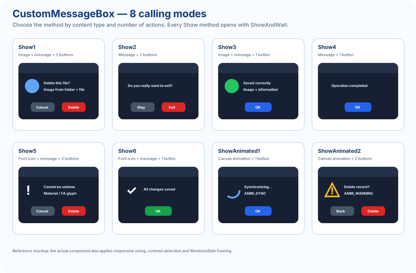
Su API está pensada alrededor de 8 modos públicos de llamada:
Show1          imagen + mensaje + Aceptar + Cancelar
Show2          mensaje + Aceptar + Cancelar
Show3          imagen + mensaje + Aceptar
Show4          mensaje + Aceptar
Show5          icono de fuente + mensaje + Aceptar + Cancelar
Show6          icono de fuente + mensaje + Aceptar
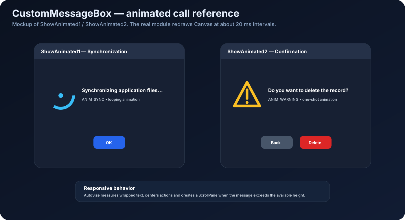
ShowAnimated1  animación + título + mensaje + Aceptar
ShowAnimated2  animación + título + mensaje + Aceptar + Cancelar
Todos los modos muestran la ventana inmediatamente mediante ShowAndWait.
No existe un Start separado como en custom_form.
Firma exacta:
Initialize( _
    callback As Object, _
    Eventname As String, _
    parent As Form)
Ejemplo:
Private Msg As CustomMessageBox

Msg.Initialize(Me, "Msg", MainForm)
callback recibe los eventos.
Eventname define el prefijo de:
EventName_Submit
EventName_Cancel
parent se utiliza como Owner de la ventana.
Configuración recomendada antes de mostrar
La clase contiene estos valores configurables:
Msg.title = "Confirmation"
Msg.colorui = fx.Colors.RGB(30, 30, 46)
Msg.colorpanel = fx.Colors.Transparent
Msg.imageicon = xui.LoadBitmap(File.DirAssets, "app.png")
Msg.panel_round = 8

Msg.borders = 5
Msg.AlwaysOnTop = False

Msg.InerShadow = False
Msg.Dropshadow = True
Msg.shadowcolor = fx.Colors.Black
También existen ExitIcon, ExitIconFont, ExitIconColor, TitleTextColor y SubTitleTextColor.
Sin embargo hay un detalle importante: durante CommonShow, TitleTextColor, ExitIconColor y SubTitleTextColor se recalculan automáticamente según la luminancia de colorui.
Por tanto, el método recomendado para conseguir buen contraste es configurar correctamente colorui y dejar que CustomMessageBox elija automáticamente texto claro u oscuro.
Contraste automático
La clase calcula:
luminance = 0.299R + 0.587G + 0.114B
Si el resultado es mayor que 160:
- título oscuro;
- botón de cierre oscuro;
- texto secundario oscuro.
Si el fondo es oscuro:
- título blanco;
- botón de cierre blanco;
- texto secundario claro.
Esto permite usar el mismo MessageBox sobre temas claros y oscuros.
MODO 1 — Show1
Imagen + mensaje + Submit + Cancel
Firma:
Show1( _
    folderlogo As String, _
    logo As String, _
    text As String, _
    submit_text As String, _
    submit_color As Int, _
    cancel_text As String, _
    cancel_color As Int, _
    buttom_round As Int)
Ejemplo:
Msg.Initialize(Me, "DeleteFile", MainForm)

Msg.title = "Delete file"
Msg.colorui = fx.Colors.RGB(30, 30, 46)
Msg.colorpanel = fx.Colors.Transparent
Msg.AlwaysOnTop = False

Msg.Show1( _
    File.DirAssets, _
    "trash.png", _
    "Do you want to delete this file?", _
    "Delete", _
    xui.Color_Red, _
    "Cancel", _
    xui.Color_DarkGray, _
    8)
La imagen se carga mediante JImageView.
folderlogo es el directorio y logo es el nombre del archivo.
buttom_round es el radio de esquina que se pasa al jButton.
MODO 2 — Show2
Mensaje + Submit + Cancel
Firma:
Show2( _
    text As String, _
    submit_text As String, _
    submit_color As Int, _
    cancel_text As String, _
    cancel_color As Int, _
    buttom_round As Int)
Ejemplo:
Msg.Initialize(Me, "ExitApp", MainForm)

Msg.title = "Exit"
Msg.colorui = fx.Colors.RGB(30, 30, 46)
Msg.AlwaysOnTop = False

Msg.Show2( _
    "Do you really want to exit?", _
    "Exit", _
    xui.Color_Red, _
    "Stay", _
    xui.Color_DarkGray, _
    8)
Es el modo más simple cuando se necesita confirmación con dos botones y no hace falta icono.
MODO 3 — Show3
Imagen + mensaje + Submit
Firma:
Show3( _
    folderlogo As String, _
    logo As String, _
    text As String, _
    submit_text As String, _
    submit_color As Int, _
    buttom_round As Int)
Ejemplo:
Msg.Initialize(Me, "Information", MainForm)

Msg.title = "Information"
Msg.colorui = fx.Colors.RGB(30, 30, 46)

Msg.Show3( _
    File.DirAssets, _
    "info.png", _
    "The configuration was saved correctly.", _
    "OK", _
    xui.Color_RGB(40, 120, 220), _
    8)
MODO 4 — Show4
Mensaje + Submit
Firma:
Show4( _
    text As String, _
    submit_text As String, _
    submit_color As Int, _
    buttom_round As Int)
Ejemplo:
Msg.Initialize(Me, "Notice", MainForm)

Msg.title = "Notice"
Msg.colorui = fx.Colors.RGB(30, 30, 46)

Msg.Show4( _
    "Operation completed.", _
    "OK", _
    xui.Color_RGB(40, 120, 220), _
    8)
Es la llamada más compacta de CustomMessageBox.
MODO 5 — Show5
Icono de fuente + mensaje + Submit + Cancel
En vez de cargar una imagen, recibe un carácter y una fuente B4X.
Firma:
Show5( _
    Icon As Char, _
    Font As B4XFont, _
    color As Int, _
    text As String, _
    submit_text As String, _
    submit_color As Int, _
    cancel_text As String, _
    cancel_color As Int, _
    buttom_round As Int)
Ejemplo Material Icons:
Msg.Initialize(Me, "DeleteItem", MainForm)

Msg.title = "Delete item"
Msg.colorui = fx.Colors.RGB(30, 30, 46)

Msg.Show5( _
    Chr(0xE872), _
    xui.CreateMaterialIcons(50), _
    xui.Color_Red, _
    "This action cannot be undone.", _
    "Delete", _
    xui.Color_Red, _
    "Cancel", _
    xui.Color_DarkGray, _
    8)
También puedes utilizar FontAwesome u otra fuente de iconos.
MODO 6 — Show6
Icono de fuente + mensaje + Submit
Firma:
Show6( _
    Icon As Char, _
    Font As B4XFont, _
    color As Int, _
    text As String, _
    submit_text As String, _
    submit_color As Int, _
    buttom_round As Int)
Ejemplo:
Msg.Initialize(Me, "Saved", MainForm)

Msg.title = "Saved"
Msg.colorui = fx.Colors.RGB(30, 30, 46)

Msg.Show6( _
    Chr(0xE86C), _
    xui.CreateMaterialIcons(50), _
    xui.Color_Green, _
    "All changes were saved.", _
    "OK", _
    xui.Color_Green, _
    8)
MODO 7 — ShowAnimated1
Animación + título + mensaje + Submit
Firma:
ShowAnimated1( _
    TitleText As String, _
    MessageText As String, _
    AnimationName As String, _
    submit_text As String, _
    submit_color As Int, _
    buttom_round As Int)
Ejemplo:
Msg.Initialize(Me, "Sync", MainForm)

Msg.colorui = fx.Colors.RGB(30, 30, 46)
Msg.colorpanel = fx.Colors.Transparent
Msg.AlwaysOnTop = False

Msg.ShowAnimated1( _
    "Synchronization", _
    "Synchronizing application files...", _
    Msg.ANIM_SYNC, _
    "OK", _
    xui.Color_RGB(40, 120, 220), _
    8)
El icono se dibuja en tiempo real con Canvas.
El timer se ejecuta aproximadamente cada 20 ms.
La duración base de cada ciclo de dibujo es 1800 ms.
MODO 8 — ShowAnimated2
Animación + título + mensaje + Submit + Cancel
Firma:
ShowAnimated2( _
    TitleText As String, _
    MessageText As String, _
    AnimationName As String, _
    submit_text As String, _
    submit_color As Int, _
    cancel_text As String, _
    cancel_color As Int, _
    buttom_round As Int)
Ejemplo según la intención de la API:
Msg.Initialize(Me, "DeleteRecord", MainForm)

Msg.colorui = fx.Colors.RGB(30, 30, 46)
Msg.AlwaysOnTop = False

Msg.ShowAnimated2( _
    "Confirmation", _
    "Do you want to delete the record?", _
    Msg.ANIM_WARNING, _
    "Delete", _
    xui.Color_Red, _
    "Back", _
    xui.Color_DarkGray, _
    8)
Nota importante de la fuente actual
En la implementación actual de ShowAnimated2, al construir los botones se utilizan los colores de forma invertida:
lblCancel  usa submit_color
lblSubmit  usa cancel_color
Por tanto, si se pasa rojo para Submit y gris para Cancel, visualmente el botón Cancel recibe rojo y Submit recibe gris.
La documentación conserva la firma real y marca este comportamiento para evitar confusión. Es un buen candidato para corregir en una próxima versión del módulo.
Eventos Submit y Cancel
La clase declara:
#Event : Submit
#Event : Cancel
Si inicializas:
Msg.Initialize(Me, "DeleteRecord", MainForm)
los eventos son:
Private Sub DeleteRecord_Submit
    Log("Confirmed")
End Sub

Private Sub DeleteRecord_Cancel
    Log("Cancelled")
End Sub
El MessageBox se cierra automáticamente después de procesar el evento.
Comportamiento del botón X
La barra de WindowsStyle agrega un botón close con ACTION_NONE.
Cuando se pulsa, Close_Click aplica esta lógica:
si existe EventName_Cancel
    → llama Cancel
si no existe Cancel pero existe Submit
    → llama Submit
después cierra
Por tanto, si deseas distinguir claramente el cierre con X, ten en cuenta que el módulo actual lo trata como Cancel cuando existe ese callback.
Responsive / AutoSize
CustomMessageBox mide el texto real y adapta la ventana.
Valores internos principales:
mínimo:             360 × 240
máximo preferido:   820 × 650
margen de pantalla: 60
La clase mide:
- ancho real del texto;
- altura real con wrap;
- espacio necesario para botones;
- icono;
- límites de la pantalla actual.
Después:
- redimensiona el Form;
- actualiza ui.RootPane;
- centra los botones;
- centra la ventana;
- actualiza TargetWidth y TargetHeight.
Si el mensaje es demasiado alto para el máximo disponible, crea automáticamente un ScrollPane vertical.
Sombras
Campos públicos:
Msg.InerShadow = True
Msg.Dropshadow = False
Msg.shadowcolor = fx.Colors.Black
La lógica actual es:
si InerShadow = True
    usa Inershadow
Else If Dropshadow = True
    usa Dropshadow
Si ambos están en True, tiene prioridad InerShadow.
AlwaysOnTop
Valor inicial:
True
Para un cuadro de mensaje normal asociado a una aplicación suele ser recomendable:
Msg.AlwaysOnTop = False
Las 47 animaciones disponibles
ANIM_SUCCESS
ANIM_ERROR
ANIM_WARNING
ANIM_INFO
ANIM_CONFETTI
ANIM_CONFUSED
ANIM_NEUTRAL
ANIM_PACMAN
ANIM_GHOST
ANIM_RAINBOW
ANIM_HEART
ANIM_KIRBY
ANIM_SAD
ANIM_SIGNAL
ANIM_CHART
ANIM_STAR
ANIM_NO_SIGNAL
ANIM_DOWNLOAD
ANIM_LOCK
ANIM_ROCKET
ANIM_SEARCH
ANIM_BELL
ANIM_ANGRY
ANIM_SYNC
ANIM_LOVE_FACE
ANIM_FIRE
ANIM_MAIL
ANIM_MONEY
ANIM_GIFT
ANIM_CAKE
ANIM_BUG
ANIM_CLOUD
ANIM_BATTERY
ANIM_PIN
ANIM_SNOW
ANIM_WINDOWS
ANIM_VIRUS
ANIM_CAT
ANIM_DOG
ANIM_DICE
ANIM_BOX_CAT
ANIM_SUNFLOWER
ANIM_CONFIG
ANIM_FOLDER
ANIM_DONE
ANIM_ELECTRIC_METER
ANIM_BULB
Usa siempre la constante del módulo en lugar de escribir el String manualmente.
Animaciones que terminan y animaciones en loop
La fuente actual considera de un solo ciclo:
SUCCESS
ERROR
DONE
STAR
LOCK
INFO
WARNING
NEUTRAL
SAD
CHART
ANGRY
NO_SIGNAL
RAINBOW
MAIL
El resto se reproduce en loop mientras el MessageBox permanezca abierto.
Resumen rápido de elección
| Necesitas | Usa |
|---|---|
| imagen + 2 botones | Show1 |
| texto + 2 botones | Show2 |
| imagen + 1 botón | Show3 |
| texto + 1 botón | Show4 |
| icono de fuente + 2 botones | Show5 |
| icono de fuente + 1 botón | Show6 |
| animación + 1 botón | ShowAnimated1 |
| animación + 2 botones | ShowAnimated2 |
Esta tabla representa la forma más rápida de decidir cómo llamar al módulo.
API pública exportada
Métodos
Initialize
Show1
Show2
Show3
Show4
Show5
Show6
ShowAnimated1
ShowAnimated2
Close_Click
GetPercentX
GetPercentY
SetSizeByPercentage
Eventos
Submit
Cancel
Campos públicos registrados
borders
InerShadow
Dropshadow
shadowcolor
AlwaysOnTop
Además la clase declara variables configurables no privadas como imageicon, colorpanel, colorui, title, panel_round y los valores de icono/texto de la barra.
Referencia B4X Forum
CustomMessageBox fue presentado públicamente con jdashboardUI v23 como el nuevo sistema de diálogos modernos de la librería, con diseño moderno, animaciones, layouts personalizados y mejor integración visual.
La fuente actual documentada aquí ya incluye AutoSize responsivo y 47 tipos de animación Canvas.