
Qué es JMenuBar
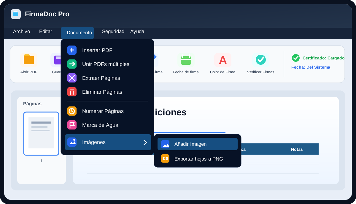
JMenuBar es la barra de menús superior de jdashboardUI para aplicaciones B4J. Sirve para crear menús como Archivo, Editar, Documento, Seguridad o Ayuda, y dentro de cada uno colocar comandos, separadores y submenús.
La forma más sencilla de entenderlo es esta:
- JMenuBar dibuja la barra y abre los menús.
- JMenuTab representa un menú principal, por ejemplo
Archivo. - jMenuItem representa una acción, por ejemplo
Abrir PDF. - JSubMenu representa un menú dentro de otro, por ejemplo
Imágenes > Añadir imagen.
No necesitas construir manualmente los paneles flotantes. JMenuBar los crea y posiciona internamente.
De qué depende
Para usarlo, piensa en cuatro piezas. No necesitas aprender todos los módulos internos de la librería.
| Pieza | Qué representa | Ejemplo |
|---|---|---|
JMenuBar |
La barra completa | Archivo · Editar · Documento |
JMenuTab |
Un menú principal | Documento |
jMenuItem |
Una acción | Insertar PDF |
JSubMenu |
Un menú dentro de otro | Imágenes > Añadir imagen |
Mapa mental
JMenuBar
├── JMenuTab "Archivo"
│   ├── jMenuItem "Abrir PDF"
│   ├── jMenuItem "Guardar"
│   └── jMenuItem "Cerrar aplicación"
│
└── JMenuTab "Documento"
    ├── jMenuItem "Insertar PDF"
    ├── jMenuItem "Unir PDFs múltiples"
    └── JSubMenu "Imágenes"
        ├── jMenuItem "Añadir imagen"
        └── jMenuItem "Exportar hojas a PNG"
Ese es exactamente el tipo de estructura que se ve en una aplicación como FirmaDoc Pro: la barra superior contiene los menús y cada opción se transforma en un evento B4J.
Qué usa internamente
El código fuente de JMenuBar confirma que el control se apoya principalmente en:
jFloatingPanel: crea la ventana flotante del menú desplegable.CustomListView: contiene visualmente los elementos del menú.jdProperties: guarda temas y estados persistentes.jdashboardUtils: utilidades de creación y estilo.JImageView: carga imágenes para tabs, items y submenús.janimations: efectos visuales.JTextFlow: composición de texto.CSSUtils,JavaObjectyReflector: integración con JavaFX, estilos, tooltips y teclado.
Todo eso es interno. En una aplicación normal tú trabajas principalmente con JMenuBar, JMenuTab, jMenuItem y JSubMenu.
JFluentMenu y JWindowsMenuStyle son otros sistemas de menú incluidos en jdashboardUI, pero no son dependencias necesarias de JMenuBar.
Cómo se implementa
La implementación recomendada es muy simple:
- Coloca
JMenuBaren el Designer. - Crea un
JMenuTab. - Crea uno o más
jMenuItem. - Agrega los items al tab.
- Envía el tab a
JMenuBarconAddMenuTab. - Crea un evento
EventName_Clickpara cada comando.
JMenuBar no expone actualmente un AddToParent público, por lo que para una integración normal la ruta más directa es usarlo como Custom View desde el Designer.
Ejemplo mínimo
Supongamos que el Custom View del Designer se llama MenuBar1.
Private Sub CreateMenus
    Dim tabArchivo As JMenuTab
    tabArchivo.Initialize("Archivo")

    Dim itemAbrir As jMenuItem
    itemAbrir.Initialize( _
        "AbrirPDF", _
        "Abrir PDF", _
        Chr(0xE2C7), _
        xui.CreateMaterialIcons(20), _
        0xFFFFB300, _
        "Abrir un archivo PDF")

    tabArchivo.AddItem(itemAbrir)

    MenuBar1.AddMenuTab(tabArchivo)
End Sub
El primer parámetro del item es muy importante:
"AbrirPDF"
Ese nombre crea el evento:
Private Sub AbrirPDF_Click
    Log("Abrir PDF")
End Sub
No tienes que conectar el clic manualmente. JMenuBar busca automáticamente una Sub con el nombre EventName_Click.
Varios comandos en Archivo
Private Sub CreateFileMenu
    Dim tabArchivo As JMenuTab
    tabArchivo.Initialize("Archivo")

    Dim abrir As jMenuItem
    abrir.Initialize("AbrirPDF", "Abrir PDF", Chr(0xE2C7), _
        xui.CreateMaterialIcons(20), 0xFFFFB300, "Abrir PDF")
    abrir.Shortcut = "Ctrl+O"

    Dim guardar As jMenuItem
    guardar.Initialize("GuardarPDF", "Guardar", Chr(0xE161), _
        xui.CreateMaterialIcons(20), 0xFF00A878, "Guardar cambios")
    guardar.Shortcut = "Ctrl+S"

    Dim cerrar As jMenuItem
    cerrar.Initialize("CerrarDocumento", "Cerrar Documento", Chr(0xE5CD), _
        xui.CreateMaterialIcons(20), 0xFFE84C4C, "Cerrar el documento")

    tabArchivo.AddItem(abrir)
    tabArchivo.AddItem(guardar)
    tabArchivo.AddItem(cerrar)
    tabArchivo.AddSeparator(0xFF64748B)

    Dim salir As jMenuItem
    salir.Initialize("CerrarAplicacion", "Cerrar aplicación", Chr(0xE8AC), _
        xui.CreateMaterialIcons(20), 0xFFFF5C7A, "Salir")
    tabArchivo.AddItem(salir)

    MenuBar1.AddMenuTab(tabArchivo)
End Sub
Crear un submenú
Para un menú como:
Documento > Imágenes > Añadir Imagen
se usa JSubMenu.
Private Sub CreateDocumentMenu
    Dim tabDocumento As JMenuTab
    tabDocumento.Initialize("Documento")

    Dim subImagenes As JSubMenu
    subImagenes.Initialize( _
        "SubImagenes", _
        "Imágenes", _
        Chr(0xE3F4), _
        xui.CreateMaterialIcons(20), _
        0xFF2F80ED)

    Dim itemAgregar As jMenuItem
    itemAgregar.Initialize("AgregarImagen", "Añadir Imagen", Chr(0xE3F4), _
        xui.CreateMaterialIcons(20), 0xFF2F80ED, "Insertar una imagen")

    Dim itemExportar As jMenuItem
    itemExportar.Initialize("ExportarPNG", "Exportar hojas a PNG", Chr(0xE3AF), _
        xui.CreateMaterialIcons(20), 0xFFF5A623, "Exportar como PNG")

    subImagenes.AddItem(itemAgregar)
    subImagenes.AddItem(itemExportar)

    tabDocumento.AddSubMenu(subImagenes)
    MenuBar1.AddMenuTab(tabDocumento)
End Sub
Los eventos siguen siendo normales:
Private Sub AgregarImagen_Click
    Log("Añadir imagen")
End Sub

Private Sub ExportarPNG_Click
    Log("Exportar a PNG")
End Sub
JMenuTab
Un JMenuTab es simplemente una sección superior del menú.
Solo texto
Dim tab As JMenuTab
tab.Initialize("Archivo")
Con icono
Dim tab As JMenuTab
tab.InitializeGraphic("Archivo", Chr(0xE2C7), _
    xui.CreateMaterialIcons(18), xui.Color_White)
Con imagen
Dim tab As JMenuTab
tab.InitializeImage("Archivo", File.DirAssets, "archivo.png")
Después puedes agregar:
tab.AddItem(miItem)
tab.AddSubMenu(miSubMenu)
tab.AddSeparator(xui.Color_Gray)
También existe:
tab.AddThemeSelector("Temas", Chr(0xE439), _
    xui.CreateMaterialIcons(18), xui.Color_Cyan)
Esto crea automáticamente un submenú con los temas disponibles.
jMenuItem
jMenuItem concentra la información de una acción de menú. En la versión actual, Initialize mantiene los parámetros de icono como opcionales, por lo que no necesitas rellenarlos cuando el item usará una imagen.
Firma actual de Initialize
Initialize( _
    EventName As String, _
    Text As String, _
    mIconText As String = "", _
    mIconFont As B4XFont = Null, _
    mIconColor As Int = xui.Color_White, _
    Tooltip As String = "")
Esto permite crear un item básico con solo:
Dim itemSave As jMenuItem
itemSave.Initialize("SaveFile", "Save")
Imagen después de Initialize
Para usar una imagen ya no es necesario inicializar el item con otro constructor. Inicializa una sola vez y aplica la imagen con SetImageIcon:
Dim itemSave As jMenuItem
itemSave.Initialize("SaveFile", "Save")
itemSave.Tooltip = "Save the active document"
itemSave.SetImageIcon(File.DirAssets, "Document-save.png")
itemSave.Shortcut = "Ctrl+S"
fileTab.AddItem(itemSave)

Dim itemSaveAs As jMenuItem
itemSaveAs.Initialize("SaveAs", "Save As...")
itemSaveAs.Tooltip = "Save the active document with a new name"
itemSaveAs.SetImageIcon(File.DirAssets, "Document-save-as.png")
itemSaveAs.Shortcut = "Ctrl+Shift+S"
fileTab.AddItem(itemSaveAs)
SetImageIcon(ImageDir, ImageFileName) cambia el item al modo imagen, limpia el icono de fuente anterior y mantiene el resto de propiedades del item.
Importante: los parámetros opcionales de
Initializesiguen siendo posicionales. El tercer parámetro esmIconText, no el tooltip. Si utilizas una imagen y quieres un tooltip, la forma más clara es asignaritem.Tooltipdespués deInitialize, como en el ejemplo anterior.
Con icono de fuente
También puedes seguir configurando el icono directamente desde Initialize:
Dim itemOpen As jMenuItem
itemOpen.Initialize( _
    "OpenPDF", _
    "Open PDF", _
    Chr(0xE2C7), _
    xui.CreateMaterialIcons(20), _
    xui.Color_White, _
    "Open a PDF file")
Propiedades útiles
item.Text = "Save as..."
item.Enabled = True
item.Visible = True
item.Shortcut = "Ctrl+Shift+S"
item.Tooltip = "Save with another name"
item.Value = 100
Value permite guardar un dato adicional dentro del objeto jMenuItem. Ese valor no se envía como parámetro al evento Click; si lo necesitas después, conserva una referencia al item o gestiona ese dato desde tu propia estructura.
Atajos de teclado
JMenuBar registra un filtro de teclado y compara la combinación con la propiedad Shortcut.
itemAbrir.Shortcut = "Ctrl+O"
itemGuardar.Shortcut = "Ctrl+S"
Cuando el usuario pulsa la combinación, se dispara el mismo evento EventName_Click.
Se soportan combinaciones construidas con:
CtrlShiftAlt
Por ejemplo:
item.Shortcut = "Ctrl+Shift+P"
Habilitar y deshabilitar opciones
Antes de agregar el item:
itemGuardar.Enabled = False
Después de construir el menú puedes buscar el item por su EventName:
MenuBar1.SetItemEnabled("GuardarPDF", False)
MenuBar1.SetItemEnabled("GuardarPDF", True)
Esta forma es especialmente útil en aplicaciones multilenguaje porque no depende del texto visible del menú.
Estados persistentes
JMenuBar puede recordar estados usando jdProperties.
Tab completo
MenuBar1.SetTabEnabledPersistent(tabArchivo, False)
Item de un tab
MenuBar1.SetTabItemEnabledPersistent(tabArchivo, "GuardarPDF", False)
Item de un submenú
MenuBar1.SetSubMenuItemEnabledPersistent(subImagenes, "ExportarPNG", False)
Para restaurar los estados guardados:
MenuBar1.RestoreStates
Disparar un comando desde código
Puedes ejecutar un item sin simular un clic del mouse:
MenuBar1.TriggerItemClick("GuardarPDF")
JMenuBar llamará a:
Private Sub GuardarPDF_Click
End Sub
Temas
JMenuBar incluye temas predefinidos.
MenuBar1.Theme = MenuBar1.THEME_MIDNIGHT_BLUE
También puedes aplicar uno directamente:
MenuBar1.ApplyPredefinedTheme(MenuBar1.THEME_DARK_PRO)
Entre los temas disponibles están:
DarkPro, LightClean, MidnightBlue, ForestGreen, DeepPurple, VampireRed, Cyberpunk, CoffeeBeans, SweetPink, WarmCream, AgedParchment, OceanBreeze, CyberOrange, NeonLime, LavenderDream, SolarFlare, MintyFresh, RoyalGold, DesertSand, CarbonRed y Glass.
Si quieres impedir que un tema cambie los colores elegidos en el Designer:
MenuBar1.LockCustomColors = True
Propiedades principales del Designer
| Propiedad | Uso |
|---|---|
MenuBarBackgroundColor |
Fondo de la barra superior |
MenuBackgroundColor |
Fondo del menú desplegable |
MenuBarActiveColor |
Color al pasar o activar |
MenuBarTextColor |
Texto de los tabs |
MenuTextColor |
Texto de los items |
TextSize |
Tamaño de texto |
Theme |
Tema predefinido |
LockCustomColors |
Bloquea cambios de tema |
MenuBarHeight |
Altura de la barra |
CornerRadius |
Radio de esquina |
BoldBarText |
Negrita en tabs |
BoldMenuText |
Negrita en items |
SeparatorDefaultColor |
Color de separadores |
MenuItemHeight |
Altura de los items |
En tiempo de ejecución también puedes cambiar ImageSize, colores, fuentes y tamaño del menú.
API pública más útil
| Método / propiedad | Uso |
|---|---|
AddMenuTab |
Agrega un JMenuTab completo |
Clear |
Limpia la barra |
SetMenuFont |
Cambia la fuente del menú |
SetMenuEnabled |
Habilita o deshabilita un menú |
SetItemEnabled |
Habilita un item por EventName |
SetItemEnabledPersistent |
Igual que el anterior, pero guarda el estado |
TriggerItemClick |
Ejecuta un item desde código |
ApplyPredefinedTheme |
Aplica un tema |
CreateThemeSelector |
Crea selector automático de temas |
RestoreStates |
Restaura estados persistentes |
Theme |
Tema actual |
CurrentTheme |
Nombre del tema activo |
ImageSize |
Tamaño de iconos basados en imagen |
Resumen rápido
Para la mayoría de aplicaciones solo necesitas recordar este patrón:
Dim tab As JMenuTab
tab.Initialize("Archivo")

Dim item As jMenuItem
item.Initialize("MiEvento", "Mi opción", Chr(0xE8B6), _
    xui.CreateMaterialIcons(20), xui.Color_White, "Descripción")

tab.AddItem(item)
MenuBar1.AddMenuTab(tab)
y luego:
Private Sub MiEvento_Click
    ' Tu código
End Sub
Eso es todo lo necesario para crear un menú funcional.
Límites actuales importantes
Estas observaciones salen del fuente actual de jdashboardUI y evitan documentar funciones que todavía no están completas:
MenuItemHeightexiste como propiedad pública y participa en cálculos internos, pero varias rutas de render todavía usan35dip. Si necesitas otra altura, pruébala visualmente antes de depender de ella.jMenuItem.TextColoralmacena un color, pero el render actual utiliza principalmente el color globalMenuTextColor.jMenuItem.Valueguarda un objeto, peroEventName_Clickno recibe parámetros.JSubMenuadmitejMenuItemy separadores. En la API pública actual no tiene otroAddSubMenu, así que no debe presentarse como un árbol de niveles ilimitados.- La API actual de JMenuBar no tiene un equivalente directo a
CheckMenuItem.
Comparación final: JMenuBar de jdashboardUI vs MenuBar nativo de B4J
B4J ya incluye un MenuBar nativo en la librería jFX. La referencia oficial de B4J indica que MenuBar contiene objetos Menu, y que un Menu puede contener MenuItem y también otros Menu. jFX además incluye CheckMenuItem, con estado Selected y evento SelectedChange.
La diferencia principal es sencilla: el MenuBar nativo es el control JavaFX estándar; JMenuBar es un sistema visual de más alto nivel pensado para jdashboardUI.
| Característica | MenuBar nativo B4J / jFX | JMenuBar de jdashboardUI |
|---|---|---|
| Base | Control JavaFX estándar expuesto por jFX |
Custom View de jdashboardUI construido sobre JavaFX |
| Estructura | Menu + MenuItem + CheckMenuItem |
JMenuTab + jMenuItem + JSubMenu |
| Creación | Código o menús del Designer declarados como JSON | Objetos B4X y AddMenuTab |
| Evento | Action; SelectedChange para CheckMenuItem |
Una Sub por comando: EventName_Click |
| Iconos | MenuItem.Image; la referencia oficial indica un tamaño típico de 16×16 |
MaterialIcons / FontAwesome con color propio o imágenes |
| Submenús | Un Menu puede contener otros Menu, por lo que permite anidación nativa profunda |
JSubMenu proporciona el nivel en cascada mostrado por FirmaDoc Pro; no expone submenús recursivos en la API actual |
| Atajos | El Designer de B4J admite Shortcut; para accelerators creados completamente por código puede usarse JavaFX |
item.Shortcut = "Ctrl+S" directamente; integra Ctrl / Shift / Alt |
| Temas | JavaFX/CSS | Más de 20 temas, colores, radio, negrita y selector automático |
| Persistencia | La implementa la aplicación | Integrada mediante jdProperties para temas y estados |
| Items marcables | Sí, con CheckMenuItem |
No en la API actual |
| Activar/desactivar por identificador | Normalmente conservando referencias o Tag |
SetItemEnabled("Evento", False) |
| Ejecutar desde código | Se llama la lógica propia o se conserva la referencia | TriggerItemClick("Evento") |
| Mejor elección | Menús estándar, items marcables o árboles nativos profundos | Apps visuales que ya usan jdashboardUI y quieren una apariencia consistente |
El código actual cambió respecto al Sneak Peek de Internet
En el Sneak Peek de JMenuBar publicado en el foro B4X el 16 de marzo de 2026 aparecían métodos como:
AddMenu
AddMenu2
AddSubMenu
AddMenuItem
AddSeparator
Era la API preliminar de aquella versión. Al revisar el fuente actual, esas rutinas de bajo nivel aparecen como internas/privadas. La forma pública recomendada ahora es:
JMenuTab
   ├── jMenuItem
   └── JSubMenu
          └── jMenuItem

          ↓

JMenuBar.AddMenuTab(...)
Por eso esta documentación usa JMenuTab, jMenuItem, JSubMenu y AddMenuTab: coincide con la versión que realmente se distribuye actualmente.
Ejemplo equivalente con el MenuBar nativo
Un MenuItem nativo puede tener su propio EventName:
Dim Archivo As Menu
Archivo.Initialize("Archivo", "")

Dim Abrir As MenuItem
Abrir.Initialize("Abrir PDF", "AbrirPDF")
Archivo.MenuItems.Add(Abrir)

MenuBar1.Menus.Add(Archivo)

Private Sub AbrirPDF_Action
    Log("Abrir PDF")
End Sub
Con JMenuBar la idea es parecida, pero el evento termina en _Click y el item puede llevar icono, color, tooltip y shortcut dentro del mismo sistema:
Dim Abrir As jMenuItem
Abrir.Initialize("AbrirPDF", "Abrir PDF", Chr(0xE2C7), _
    xui.CreateMaterialIcons(20), 0xFFFFB300, "Abrir archivo")
Abrir.Shortcut = "Ctrl+O"

Private Sub AbrirPDF_Click
    Log("Abrir PDF")
End Sub
Conclusión práctica
Para una interfaz como FirmaDoc Pro, donde ya se usan iconos coloreados, opciones deshabilitadas, separadores, un submenú lateral como Imágenes, temas y estados persistentes, JMenuBar encaja mejor con el resto de jdashboardUI.
Si la aplicación solo necesita un menú JavaFX estándar, requiere CheckMenuItem o necesita muchos niveles de menús anidados, el MenuBar nativo de B4J es más directo. No es inferior ni está obsoleto: es el control estándar de JavaFX.
Referencias externas revisadas
- Referencia oficial B4J jFX (
Menu,MenuBar,MenuItem,CheckMenuItem):https://www.b4x.com/b4j/help/jfx.html - Tutorial de Erel sobre menús en el Designer (JSON, EventName, Tag, Shortcut, etc.):
https://www.b4x.com/android/forum/threads/designer-menu-items.56602/ - Sneak Peek original de JMenuBar:
https://www.b4x.com/android/forum/threads/%F0%9F%9A%80-sneak-peek-jmenubar-is-coming-to-jdashboardui.170603/
Actualización 2026: tutorial de implementación y nuevas funciones
La barra de menús está formada por JMenuBar, JMenuTab, jMenuItem y JSubMenu. Coloca JMenuBar como CustomView en el Designer; crea un JMenuTab por cada menú Archivo, Editar, Ver o Ayuda; agrega elementos jMenuItem, separadores y submenús; añade los tabs mediante AddMenuTab; y gestiona cada comando con EventName_Click.
Selección de iconos y compatibilidad con Debug
Utiliza Initialize antes de los inicializadores gráficos y evita aplicar SetImageIcon sobre un jMenuItem sin inicializar. InitializeGraphic e InitializeImage requieren especial atención a la secuencia de inicialización cuando trabajas en B4J Debug Mode.
Estados de menús y persistencia
Un editor puede deshabilitar Guardar si no hay cambios, Imprimir si no hay documento, o Exportar si todavía no existen resultados. Para un cambio temporal usa SetItemEnabled. Para conservarlo entre sesiones utiliza SetItemEnabledPersistent(MenuName, EventName, Enabled), con sus tres argumentos. La identidad estable es EventName; no utilices el texto traducido para encontrar la opción. RestoreStates recupera las preferencias guardadas.
Casos de uso y métodos
Con JMenuTab.AddItem construyes acciones; JMenuTab.AddSubMenu y JSubMenu.AddItem crean menús en cascada; jMenuItem.SetImageIcon permite usar iconos basados en archivos; ApplyPredefinedTheme, SaveTheme, LoadTheme y CreateThemeSelector gestionan temas. Para menús estándar de JavaFX también existe el MenuBar nativo, pero sus métodos no son intercambiables.
La referencia completa incluida a continuación cubre 89 métodos públicos de la familia, con las declaraciones reales, parámetros, retornos, eventos, imágenes, temas y ejemplos de aplicación.
Referencia técnica completa y ejemplos adicionales (firmas de B4J en inglés)
Library: jdashboardUI · Platform: B4J / JavaFX · Verified against:
jdashboardUI(20261108-154221).b4xlib(8 November 2026).
JMenuBar provides a desktop application menu bar: File, Edit, View, Tools and Help, each opening a styled dropdown. The user can choose commands by mouse or keyboard shortcut, and menu items can show icons, images, text, tooltips and enabled/disabled states. This feature is composed of four different B4J classes—do not confuse the names.
1. Understand the four classes
| Class | Responsibility | Typical use |
|---|---|---|
JMenuBar |
Draws/coordinates the main bar, routes commands, maintains themes/states | Application-wide File / Edit / Help menus |
JMenuTab |
Container for one top-level label and its resources | The File top-level tab |
jMenuItem |
Represents one clickable command | Save, Open PDF, Undo, About |
JSubMenu |
Represents a nested menu under a top-level tab | File → Export → PDF/PNG |
The typical hierarchy is JMenuBar → JMenuTab → jMenuItem and/or JSubMenu → jMenuItem. JSubMenu exposes AddItem and AddSeparator, but no public AddSubMenu: the library is not a general unlimited-depth recursive menu builder. For arbitrarily nested menus, use JToolBar's AddSubMenu system instead where it suits your interface.
2. Preparation and a working menu
- Install and select
jdashboardUIin a B4J project. - In the Visual Designer add the
JMenuBarCustomView, name itMenuBar1, adjust its host width andMenuBarHeight, and save the layout asMain. - Load the layout in
AppStart. There is no publicJMenuBar.AddToParentin this build; Designer integration is the documented path. - Create a
JMenuTab, add one or morejMenuItemobjects to it, then callMenuBar1.AddMenuTab(tab). - Implement the command callbacks named after the item
EventName.
Sub Process_Globals
    Private fx As JFX
    Private MainForm As Form
    Private xui As XUI
    Private MenuBar1 As JMenuBar
End Sub

Sub AppStart(Form1 As Form, Args() As String)
    MainForm = Form1
    MainForm.RootPane.LoadLayout("Main")
    MainForm.Show
    CreateFileMenu
End Sub

Private Sub CreateFileMenu
    Dim tabFile As JMenuTab
    tabFile.Initialize("File")

    Dim save As jMenuItem
    save.Initialize("SaveFile", "Save")
    save.Shortcut = "Ctrl+S"
    save.Tooltip = "Save the current file"
    tabFile.AddItem(save)

    tabFile.AddSeparator(xui.Color_Gray)

    Dim close As jMenuItem
    close.Initialize("CloseFile", "Close")
    tabFile.AddItem(close)

    MenuBar1.AddMenuTab(tabFile)
End Sub

Private Sub SaveFile_Click
    Log("Save selected")
End Sub

Private Sub CloseFile_Click
    Log("Close selected")
End Sub
Result: File opens a dropdown with Save and Close; the Save item shows a keyboard shortcut. The menu item event identifier is SaveFile, so its event handler is SaveFile_Click. Do not write MenuBar1_SaveFile_Click.
3. Text, icon and image tabs
3.1. Plain text tab
Dim editTab As JMenuTab
editTab.Initialize("Edit")
3.2. Tab with a font icon: important Debug-mode initialization
Dim toolsTab As JMenuTab
toolsTab.Initialize("Tools")
toolsTab.InitializeGraphic("Tools", Chr(0xF0AD), xui.CreateFontAwesome(18), 0xFF45A3ED)
Although InitializeGraphic fills the tab's fields, the supplied source explicitly recommends calling Initialize first to connect the B4X class instance in Debug mode. Use the same two-stage pattern when switching to an image tab. This avoids problems caused by an object that has not been initialized in the B4X context.
3.3. Tab with an image
Dim helpTab As JMenuTab
helpTab.Initialize("Help")
helpTab.InitializeImage("Help", File.DirAssets, "help.png")
The file help.png must be present in the application's Files directory. InitializeImage sets image mode and stores the image path; it is not a constructor for a separate bitmap class.
4. Menu actions and jMenuItem properties
4.1. Minimal item
Dim m As jMenuItem
m.Initialize("ShowAbout", "About this app")
m.Tooltip = "Version, license and support details"
m.Enabled = True
m.Visible = True
helpTab.AddItem(m)

Private Sub ShowAbout_Click
    Log("Open About dialog")
End Sub
Initialize accepts optional icon parameters. Its real defaults in this build include mIconFont = xui.CreateFontAwesome(22) and mIconColor = xui.Color_White; it is inaccurate to describe the default font as Null. The parameters are positional. To assign only a tooltip, the simplest and safest pattern is to assign .Tooltip after calling Initialize.
4.2. Icon-based item
Dim open As jMenuItem
open.Initialize("OpenFile", "Open", Chr(0xF07C), xui.CreateFontAwesome(18), _
    0xFF4B96DC, "Choose a file from disk")
open.Shortcut = "Ctrl+O"
tabFile.AddItem(open)
Glyph codes and fonts must match. For example, FontAwesome codes should be paired with an actual FontAwesome font from xui.CreateFontAwesome. A valid glyph with the wrong font can appear as a square or an unexpected icon.
4.3. Image-based item (safe two-step initialization)
Dim exportPdf As jMenuItem
exportPdf.Initialize("ExportPdf", "Export PDF")
exportPdf.SetImageIcon(File.DirAssets, "pdf.png")
exportPdf.Shortcut = "Ctrl+Shift+E"
exportPdf.Tooltip = "Save a PDF copy"
tabFile.AddItem(exportPdf)
SetImageIcon does not recreate the item: it clears the previous glyph, enables image mode and preserves the other fields such as text, EventName, tooltip, shortcut and value. It requires the item to be initialized first, especially in B4J Debug. Do not set IsImage=True by itself and expect an image to appear without supplying ImageDir and ImageName; SetImageIcon is the recommended path.
4.4. Attach application data to a menu item
Dim recentFile As jMenuItem
recentFile.Initialize("OpenRecentInvoice", "Invoice 2026.xlsx")
recentFile.Value = "C:\Work\Invoices\Invoice 2026.xlsx"
tabFile.AddItem(recentFile)
The Value property is available for app-specific data such as a file path or record ID. Your application is responsible for keeping a reference to the item or another lookup so the event handler can retrieve that value. EventName itself is read-only after initialization; prefer choosing stable identifiers at creation time.
5. Submenus and separators
Dim exportMenu As JSubMenu
exportMenu.Initialize("export", "Export", Chr(0xF56E), _
    xui.CreateFontAwesome(18), 0xFF2E9AAB)

Dim exportText As jMenuItem
exportText.Initialize("ExportText", "Plain text")
Dim exportJson As jMenuItem
exportJson.Initialize("ExportJson", "JSON")

exportMenu.AddItem(exportText)
exportMenu.AddSeparator
exportMenu.AddItem(exportJson)
tabFile.AddSubMenu(exportMenu)

Private Sub ExportText_Click
    Log("Export to a .txt file")
End Sub

Private Sub ExportJson_Click
    Log("Export to JSON")
End Sub
JSubMenu.Initialize needs its ID, title, glyph text, glyph font and glyph color. For an image-backed submenu, first call Initialize and then InitializeImage as recommended by the library source:
Dim exportImages As JSubMenu
exportImages.Initialize("exportImages", "Images", "", Null, 0)
exportImages.InitializeImage("exportImages", "Images", File.DirAssets, "images.png")
A JMenuTab separator accepts a color via AddSeparator(Color). A JSubMenu separator does not accept a color parameter: call AddSeparator without arguments.
6. Keyboard shortcuts
open.Shortcut = "Ctrl+O"
save.Shortcut = "Ctrl+S"
exportPdf.Shortcut = "Ctrl+Shift+E"
The source includes keyboard routing for shortcuts using the menu item's EventName. The familiar modifier names Ctrl, Shift and Alt are supported in the documented shortcut patterns. Test keyboard combinations that may be reserved by the operating system or desktop environment; the menu cannot override all system-wide shortcuts. TriggerItemClick("SaveFile") is a separate method that invokes a menu command from B4J code:
MenuBar1.TriggerItemClick("SaveFile")
7. Enable, disable and persist commands
7.1. Simple runtime enable/disable
MenuBar1.SetItemEnabled("SaveFile", False)
MenuBar1.SetItemEnabled("SaveFile", True)
MenuBar1.SetMenuEnabled("File", False)
MenuBar1.SetMenuEnabled("File", True)
SetItemEnabled locates the menu command by EventName, not its translated visible text. SetMenuEnabled targets the top-level menu name. This separation is especially useful in multilingual applications or apps where the Save button becomes available only when changes exist.
7.2. Saved enabled states
MenuBar1.SetTabEnabledPersistent(tabFile, True)
MenuBar1.SetTabItemEnabledPersistent(tabFile, "SaveFile", False)
MenuBar1.SetSubMenuItemEnabledPersistent(exportMenu, "ExportJson", False)
MenuBar1.SetItemEnabledPersistent("File", "SaveFile", True)
MenuBar1.RestoreStates
The persistence implementation uses the library's jdProperties backing store (configured as Config/menu_settings.db in the source). Use the exact overload appropriate to your target: entire tab, a specific item within a tab, a submenu child, or an item identified by its top-level menu name and EventName. Build the menu before RestoreStates so there are instances to update. If persistent state clashes with a temporary runtime rule (for example, no active document), reapply the current runtime rule after state restoration.
8. Themes, colors and sizes
8.1. Choose a predefined theme
MenuBar1.ApplyPredefinedTheme(MenuBar1.THEME_DARK_PRO)
MenuBar1.Theme = MenuBar1.THEME_MIDNIGHT_BLUE
The source defines 21 theme constants: DarkPro, LightClean, MidnightBlue, ForestGreen, DeepPurple, VampireRed, Cyberpunk, CoffeeBeans, SweetPink, WarmCream, AgedParchment, OceanBreeze, CyberOrange, NeonLime, LavenderDream, SolarFlare, MintyFresh, RoyalGold, DesertSand, CarbonRed and Glass. You can retrieve the current selection through CurrentTheme. LockCustomColors=True prevents theme overrides and favors Designer-defined colors.
8.2. Save a user theme
MenuBar1.SaveTheme("MyOfficeTheme")
MenuBar1.LoadTheme("MyOfficeTheme")
SaveTheme records the current bar/menu background and text colors, active color and text size. LoadTheme retrieves a previously saved theme when it exists. It does not necessarily serialize every advanced Designer property such as custom corner radii or item images. CreateThemeSelector and JMenuTab.AddThemeSelector allow the application to expose built-in theme selection through its own menu, with no extra dialog required.
8.3. Adjust visual density
For a compact business app, set MenuBarHeight around 40dip and MenuItemHeight around 35dip. Use TextSize, BoldBarText, BoldMenuText, CornerRadius, SeparatorDefaultColor and ImageSize to tune visual appearance. A theme changes the broader palette; individual properties can be used to fine-tune the current layout. Distinguish the B4J Designer property keys (e.g. MenuBarBackgroundColor) from runtime property names exposed by the class (e.g. BarBackgroundColor). The full verified signatures are listed below.
9. Real-world use cases
9.1. File editor
Use File for New/Open/Save/Export/Close, Edit for Undo/Redo, and View for Themes. Only enable Save when a document has changes. Give each command a stable EventName so localization does not break its callback.
9.2. Sales administration application
Create Orders, Reports, and Settings tabs. Assign a shortcut to frequent actions, disable report export for users without permission, and keep labels and tooltips clear. Remember that disabling a GUI command is not authorization: enforce privileges again in the underlying operation.
9.3. Long-running project with theme persistence
Place a theme selector under View, allow the user to choose DarkPro or LightClean, and use SaveTheme/LoadTheme if you expose custom palettes. Persist availability only when it represents a genuine user preference; task-specific enabled states may need to be recalculated on startup.
10. Troubleshooting
| Symptom | Cause | Solution |
|---|---|---|
| Image tab or item fails in Debug | Object was not initialized as required | Call Initialize before InitializeImage or SetImageIcon. |
| Click does not reach callback | Handler based on visible text rather than EventName | Use SaveFile_Click for an item initialized with "SaveFile". |
| Menu bar is absent | CustomView not placed/loaded in Designer | Add JMenuBar to the layout and call LoadLayout before creating menus. |
| Shortcut unexpectedly fails | Unsupported/reserved combination or inactive scene | Start with Ctrl+S; verify JavaFX scene focus and the item state. |
| Colors change between runs | Persisted theme takes precedence | Review stored theme, LoadTheme, and LockCustomColors. |
| A menu remains disabled | Previously persisted state overrides startup settings | Call RestoreStates at the correct point, then enforce current application rules. |
| Menu item with image is blank | Missing asset or image mode not configured | Call SetImageIcon(File.DirAssets, filename) after Initialize. |
| Want a third-level nested submenu | JSubMenu has no AddSubMenu |
Redesign hierarchy or use JToolBar's native menu model. |
11. Public API — exhaustive signatures and descriptions
The appendix contains all public methods, property getter/setter methods, constants and public fields found in the four included classes, not only the methods used in the tutorial. Property getX/setX signatures correspond to the natural object.X B4J property syntax. Respect read-only fields where only getX is provided.
Complete source-verified reference: JMenuBar
Designer properties and defaults
| Property key | Field type | Default / options | Meaning |
|---|
| MenuBarBackgroundColor | Color | 0xFF121212 | Visual Designer configuration; the corresponding runtime property, if available, appears in the method reference. |
| MenuBackgroundColor | Color | 0xFF1E1E1E | Visual Designer configuration; the corresponding runtime property, if available, appears in the method reference. |
| MenuBarActiveColor | Color | 0xFF0078D7 | Visual Designer configuration; the corresponding runtime property, if available, appears in the method reference. |
| TextSize | Int | 14 | Visual Designer configuration; the corresponding runtime property, if available, appears in the method reference. |
| MenuBarTextColor | Color | 0xFFECECEC | Visual Designer configuration; the corresponding runtime property, if available, appears in the method reference. |
| MenuTextColor | Color | 0xFFFFFFFF | Visual Designer configuration; the corresponding runtime property, if available, appears in the method reference. |
| Theme | String | None · Choices: None, DarkPro, LightClean, MidnightBlue, ForestGreen, DeepPurple, VampireRed, Cyberpunk, CoffeeBeans, SweetPink, WarmCream, AgedParchment, OceanBreeze, CyberOrange, NeonLime, LavenderDream, SolarFlare, MintyFresh, RoyalGold, DesertSand, CarbonRed, Glass | Predefined theme |
| LockCustomColors | Boolean | False | When True themes are blocked and only designer custom colors are used |
| MenuBarHeight | Int | 40 | Height of the menu bar in dip |
| CornerRadius | Int | 0 | Corner radius of the menu bar |
| BoldBarText | Boolean | False | Use bold font for menu bar tabs |
| BoldMenuText | Boolean | False | Use bold font for dropdown menu items |
| SeparatorDefaultColor | Color | 0xFF444444 | Default color for menu separators |
| MenuItemHeight | Int | 35 | Height of each menu item in dip |
These keys configure a Designer CustomView. They are not automatically callable setters; check the public method list before writing Component.Property = value.
Public constants
-
Public Const THEME_DARK_PRO As String = "DarkPro" -
Public Const THEME_LIGHT_CLEAN As String = "LightClean" -
Public Const THEME_MIDNIGHT_BLUE As String = "MidnightBlue" -
Public Const THEME_FOREST_GREEN As String = "ForestGreen" -
Public Const THEME_DEEP_PURPLE As String = "DeepPurple" -
Public Const THEME_VAMPIRE_RED As String = "VampireRed" -
Public Const THEME_CYBERPUNK As String = "Cyberpunk" -
Public Const THEME_COFFEE_BEANS As String = "CoffeeBeans" -
Public Const THEME_SWEET_PINK As String = "SweetPink" -
Public Const THEME_WARM_CREAM As String = "WarmCream" -
Public Const THEME_AGED_PARCHMENT As String = "AgedParchment" -
Public Const THEME_OCEAN_BREEZE As String = "OceanBreeze" -
Public Const THEME_CYBER_ORANGE As String = "CyberOrange" -
Public Const THEME_NEON_LIME As String = "NeonLime" -
Public Const THEME_LAVENDER_DREAM As String = "LavenderDream" -
Public Const THEME_SOLAR_FLARE As String = "SolarFlare" -
Public Const THEME_MINTY_FRESH As String = "MintyFresh" -
Public Const THEME_ROYAL_GOLD As String = "RoyalGold" -
Public Const THEME_DESERT_SAND As String = "DesertSand" -
Public Const THEME_CARBON_RED As String = "CarbonRed" -
Public Const THEME_GLASS As String = "Glass"
Public fields
Public mBase As B4XView
Prefer the documented methods/properties where offered. Public data fields can be mutable; changing them after a menu is rendered may not automatically refresh its layout.
All JMenuBar Public Sub declarations (49)
JMenuBar.Initialize
Public Sub Initialize(Callback As Object, EventName As String)
Initializes the JMenuBar event target, menu collection and jdProperties persistence resource.
Parameters:
Callback(Object): B4J object that receives the component events (normally Me).EventName(String): Unique, stable identifier used for command callbacks and later lookups.
Returns: no return value (Sub).
Lifecycle: normally called by framework initialization or by the code-created pattern; do not call the Designer lifecycle method again after LoadLayout.
JMenuBar.DesignerCreateView
Public Sub DesignerCreateView (Base As Object, Lbl As Label, Props As Map)
Creates the visual menu bar from Designer settings; invoked by the framework during layout loading.
Parameters:
Base(Object): The view supplied by the B4J Designer.Lbl(Label): The Designer label carrying font and text settings.Props(Map): A Map of properties provided by the Designer.
Returns: no return value (Sub).
Lifecycle: normally called by framework initialization or by the code-created pattern; do not call the Designer lifecycle method again after LoadLayout.
JMenuBar.SaveTheme
Public Sub SaveTheme(ThemeName As String)
Stores the current color palette and text size under a named theme, and saves the last-applied theme name.
Parameters:
ThemeName(String): The name of the theme to load, save or apply.
Returns: no return value (Sub).
JMenuBar.LoadTheme
Public Sub LoadTheme(ThemeName As String)
Loads a previously saved named theme from jdProperties and refreshes the menu bar.
Parameters:
ThemeName(String): The name of the theme to load, save or apply.
Returns: no return value (Sub).
JMenuBar.RestoreStates
Public Sub RestoreStates
Reapplies previously persisted enabled states to the menus and items that have already been constructed.
Returns: no return value (Sub).
JMenuBar.Clear
Public Sub Clear
Clears the current menu bar resources.
Returns: no return value (Sub).
JMenuBar.SetMenuFont
Public Sub SetMenuFont(Font As B4XFont)
Sets the dropdown menu text font.
Parameters:
Font(B4XFont): B4XFont to use in labels or menus.
Returns: no return value (Sub).
JMenuBar.setBarMenuCorner
Public Sub setBarMenuCorner(corner As Double,top As Boolean,bottom As Boolean)
Changes the bar/menu corner styling; keep consistent with CornerRadius and the active theme.
Parameters:
corner(Double): The desired rounded-corner radius.top(Boolean): Top coordinate or top-corner flag, as specified by the type.bottom(Boolean): Whether bottom corners should be rounded.
Returns: no return value (Sub).
JMenuBar.SetMenuEnabled
Public Sub SetMenuEnabled(MenuName As String, Enabled As Boolean)
Enables or disables a top-level menu identified by its menu title/key.
Parameters:
MenuName(String): Specify the menu name used by this operation.Enabled(Boolean): Whether this command/control accepts user action.
Returns: no return value (Sub).
JMenuBar.SetTabEnabledPersistent
Public Sub SetTabEnabledPersistent(mTAB As JMenuTab, Enabled As Boolean)
Changes and persistently records the enabled state for a JMenuTab.
Parameters:
mTAB(JMenuTab): The JMenuTab instance whose resources/state will change.Enabled(Boolean): Whether this command/control accepts user action.
Returns: no return value (Sub).
JMenuBar.SetTabItemEnabledPersistent
Public Sub SetTabItemEnabledPersistent(mTAB As JMenuTab, EventName As String, Enabled As Boolean)
Changes and persistently records one item state within a given tab.
Parameters:
mTAB(JMenuTab): The JMenuTab instance whose resources/state will change.EventName(String): Unique, stable identifier used for command callbacks and later lookups.Enabled(Boolean): Whether this command/control accepts user action.
Returns: no return value (Sub).
JMenuBar.SetSubMenuItemEnabledPersistent
Public Sub SetSubMenuItemEnabledPersistent(SMenu As JSubMenu, EventName As String, Enabled As Boolean)
Changes and persistently records one item state within a given JSubMenu.
Parameters:
SMenu(JSubMenu): The JSubMenu object containing this menu entry.EventName(String): Unique, stable identifier used for command callbacks and later lookups.Enabled(Boolean): Whether this command/control accepts user action.
Returns: no return value (Sub).
JMenuBar.setBarBackgroundColor
Public Sub setBarBackgroundColor(Color As Int)
Changes the BarBackgroundColor property. The bar background color configuration of this component.
Parameters:
Color(Int): ARGB color; some methods use zero as a special “keep/inherit” value.
Returns: no return value (Sub).
JMenuBar.getBarBackgroundColor
Public Sub getBarBackgroundColor As Int
Returns the BarBackgroundColor property. The bar background color configuration of this component.
Returns: Int. The returned value; check readiness and validity as explained in the tutorial.
JMenuBar.setMenuBackgroundColor
Public Sub setMenuBackgroundColor(Color As Int)
Changes the MenuBackgroundColor property. The menu background color configuration of this component.
Parameters:
Color(Int): ARGB color; some methods use zero as a special “keep/inherit” value.
Returns: no return value (Sub).
JMenuBar.getMenuBackgroundColor
Public Sub getMenuBackgroundColor As Int
Returns the MenuBackgroundColor property. The menu background color configuration of this component.
Returns: Int. The returned value; check readiness and validity as explained in the tutorial.
JMenuBar.setBarTextColor
Public Sub setBarTextColor(Color As Int)
Changes the BarTextColor property. The bar text color configuration of this component.
Parameters:
Color(Int): ARGB color; some methods use zero as a special “keep/inherit” value.
Returns: no return value (Sub).
JMenuBar.setTextSize
Public Sub setTextSize(Size As Int)
Changes the TextSize property. The text size configuration of this component.
Parameters:
Size(Int): The desired icon or text size.
Returns: no return value (Sub).
JMenuBar.getBarTextColor
Public Sub getBarTextColor As Int
Returns the BarTextColor property. The bar text color configuration of this component.
Returns: Int. The returned value; check readiness and validity as explained in the tutorial.
JMenuBar.setMenuTextColor
Public Sub setMenuTextColor(Color As Int)
Changes the MenuTextColor property. The menu text color configuration of this component.
Parameters:
Color(Int): ARGB color; some methods use zero as a special “keep/inherit” value.
Returns: no return value (Sub).
JMenuBar.getMenuTextColor
Public Sub getMenuTextColor As Int
Returns the MenuTextColor property. The menu text color configuration of this component.
Returns: Int. The returned value; check readiness and validity as explained in the tutorial.
JMenuBar.getTextSize
Public Sub getTextSize As Int
Returns the TextSize property. The text size configuration of this component.
Returns: Int. The returned value; check readiness and validity as explained in the tutorial.
JMenuBar.setActiveColor
Public Sub setActiveColor(Color As Int)
Changes the ActiveColor property. The active color configuration of this component.
Parameters:
Color(Int): ARGB color; some methods use zero as a special “keep/inherit” value.
Returns: no return value (Sub).
JMenuBar.getActiveColor
Public Sub getActiveColor As Int
Returns the ActiveColor property. The active color configuration of this component.
Returns: Int. The returned value; check readiness and validity as explained in the tutorial.
JMenuBar.ApplyPredefinedTheme
Public Sub ApplyPredefinedTheme(ThemeName As String)
Applies one of the public THEME_* presets when custom-color locking permits.
Parameters:
ThemeName(String): The name of the theme to load, save or apply.
Returns: no return value (Sub).
JMenuBar.CreateThemeSelector
Public Sub CreateThemeSelector(ParentMenu As String, Title As String, IconChar As String, IconFont As B4XFont, IconColor As Int)
Creates an interface for choosing available menu themes.
Parameters:
ParentMenu(String): Identifier of the parent menu.Title(String): The menu label shown to the user.IconChar(String): Icon font glyph for the menu.IconFont(B4XFont): B4XFont/Font containing the chosen glyph.IconColor(Int): Color assigned to the glyph (usually ARGB).
Returns: no return value (Sub).
JMenuBar.AddMenuTab
Public Sub AddMenuTab(mTAB As JMenuTab)
Adds a JMenuTab to the top menu bar, rendering its items and nested JSubMenu resources.
Parameters:
mTAB(JMenuTab): The JMenuTab instance whose resources/state will change.
Returns: no return value (Sub).
JMenuBar.setLockCustomColors
Public Sub setLockCustomColors(Lock As Boolean)
Changes the LockCustomColors property. When True, ignore automatic theme changes to preserve Designer colors.
Parameters:
Lock(Boolean): Whether custom colors are protected from themes.
Returns: no return value (Sub).
JMenuBar.getLockCustomColors
Public Sub getLockCustomColors As Boolean
Returns the LockCustomColors property. When True, ignore automatic theme changes to preserve Designer colors.
Returns: Boolean. Success/failure status.
JMenuBar.setMenuBarHeight
Public Sub setMenuBarHeight(Height As Int)
Changes the MenuBarHeight property. The menu bar height configuration of this component.
Parameters:
Height(Int): Height expressed in device-independent pixels (dip).
Returns: no return value (Sub).
JMenuBar.getMenuBarHeight
Public Sub getMenuBarHeight As Int
Returns the MenuBarHeight property. The menu bar height configuration of this component.
Returns: Int. The returned value; check readiness and validity as explained in the tutorial.
JMenuBar.setCornerRadius
Public Sub setCornerRadius(Radius As Int)
Changes the CornerRadius property. The corner radius configuration of this component.
Parameters:
Radius(Int): Requested corner radius in dip.
Returns: no return value (Sub).
JMenuBar.getCornerRadius
Public Sub getCornerRadius As Int
Returns the CornerRadius property. The corner radius configuration of this component.
Returns: Int. The returned value; check readiness and validity as explained in the tutorial.
JMenuBar.setBoldBarText
Public Sub setBoldBarText(Bold As Boolean)
Changes the BoldBarText property. The bold bar text configuration of this component.
Parameters:
Bold(Boolean): Whether bold font styling is enabled.
Returns: no return value (Sub).
JMenuBar.getBoldBarText
Public Sub getBoldBarText As Boolean
Returns the BoldBarText property. The bold bar text configuration of this component.
Returns: Boolean. Success/failure status.
JMenuBar.setBoldMenuText
Public Sub setBoldMenuText(Bold As Boolean)
Changes the BoldMenuText property. The bold menu text configuration of this component.
Parameters:
Bold(Boolean): Whether bold font styling is enabled.
Returns: no return value (Sub).
JMenuBar.getBoldMenuText
Public Sub getBoldMenuText As Boolean
Returns the BoldMenuText property. The bold menu text configuration of this component.
Returns: Boolean. Success/failure status.
JMenuBar.setSeparatorDefaultColor
Public Sub setSeparatorDefaultColor(Color As Int)
Changes the SeparatorDefaultColor property. The separator default color configuration of this component.
Parameters:
Color(Int): ARGB color; some methods use zero as a special “keep/inherit” value.
Returns: no return value (Sub).
JMenuBar.getSeparatorDefaultColor
Public Sub getSeparatorDefaultColor As Int
Returns the SeparatorDefaultColor property. The separator default color configuration of this component.
Returns: Int. The returned value; check readiness and validity as explained in the tutorial.
JMenuBar.setMenuItemHeight
Public Sub setMenuItemHeight(Height As Int)
Changes the MenuItemHeight property. The menu item height configuration of this component.
Parameters:
Height(Int): Height expressed in device-independent pixels (dip).
Returns: no return value (Sub).
JMenuBar.getMenuItemHeight
Public Sub getMenuItemHeight As Int
Returns the MenuItemHeight property. The menu item height configuration of this component.
Returns: Int. The returned value; check readiness and validity as explained in the tutorial.
JMenuBar.getCurrentTheme
Public Sub getCurrentTheme As String
Returns the CurrentTheme property. Current menu bar theme name.
Returns: String. The returned value; check readiness and validity as explained in the tutorial.
JMenuBar.setTheme
Public Sub setTheme(ThemeName As String)
Changes the Theme property. Chosen menu bar theme.
Parameters:
ThemeName(String): The name of the theme to load, save or apply.
Returns: no return value (Sub).
JMenuBar.getTheme
Public Sub getTheme As String
Returns the Theme property. Chosen menu bar theme.
Returns: String. The returned value; check readiness and validity as explained in the tutorial.
JMenuBar.SetItemEnabledPersistent
Public Sub SetItemEnabledPersistent(MenuName As String, EventName As String, Enabled As Boolean)
Persistently records an item enabled state by its global EventName.
Parameters:
MenuName(String): Specify the menu name used by this operation.EventName(String): Unique, stable identifier used for command callbacks and later lookups.Enabled(Boolean): Whether this command/control accepts user action.
Returns: no return value (Sub).
JMenuBar.SetItemEnabled
Public Sub SetItemEnabled(EventName As String, Enabled As Boolean)
Changes enabled state of an item identified by its stable EventName.
Parameters:
EventName(String): Unique, stable identifier used for command callbacks and later lookups.Enabled(Boolean): Whether this command/control accepts user action.
Returns: no return value (Sub).
JMenuBar.TriggerItemClick
Programmatically invokes the event callback for a menu item identified by EventName.
Parameters:
EventName(String): Unique, stable identifier used for command callbacks and later lookups.
Returns: no return value (Sub).
JMenuBar.TriggerItemClick
Public Sub TriggerItemClick(EventName As String)
Programmatically invokes the event callback of the menu item identified by EventName. This is useful for a toolbar shortcut that triggers exactly the same action as a menu command. The parameter must match the stable event identifier, not the visible translated caption. No return value.
JMenuBar.setImageSize
Public Sub setImageSize(Size As Int)
Changes the ImageSize property. Default menu icon/image size (where used by implementation).
Parameters:
Size(Int): The desired icon or text size.
Returns: no return value (Sub).
JMenuBar.getImageSize
Public Sub getImageSize As Int
Returns the ImageSize property. Default menu icon/image size (where used by implementation).
Returns: Int. The returned value; check readiness and validity as explained in the tutorial.
Complete source-verified reference: JMenuTab
Public fields
-
Public Title As String -
Public Resources As List -
Public IsGraphic As Boolean -
Public IconText As String -
Public IconFont As B4XFont -
Public IconColor As Int -
Public IsImage As Boolean -
Public ImageDir As String -
Public ImageName As String
Prefer the documented methods/properties where offered. Public data fields can be mutable; changing them after a menu is rendered may not automatically refresh its layout.
All JMenuTab Public Sub declarations (7)
JMenuTab.Initialize
Public Sub Initialize(mTitle As String)
Initializes a text-only top-level menu and its resources collection.
Parameters:
mTitle(String): The visible title for this menu or submenu.
Returns: no return value (Sub).
Lifecycle: normally called by framework initialization or by the code-created pattern; do not call the Designer lifecycle method again after LoadLayout.
JMenuTab.InitializeGraphic
Public Sub InitializeGraphic(mTitle As String, mIconText As String, mIconFont As B4XFont, mIconColor As Int)
Initializes a top-level menu with a font glyph; call Initialize first in Debug-oriented integrations.
Parameters:
mTitle(String): The visible title for this menu or submenu.mIconText(String): The icon glyph character.mIconFont(B4XFont): The font that contains the glyph.mIconColor(Int): ARGB color of the icon glyph.
Returns: no return value (Sub).
JMenuTab.InitializeImage
Public Sub InitializeImage(mTitle As String, mImageDir As String, mImageName As String)
Initializes a top-level menu with an image; initialize the B4X object first.
Parameters:
mTitle(String): The visible title for this menu or submenu.mImageDir(String): The directory containing the menu image.mImageName(String): The menu image's filename.
Returns: no return value (Sub).
JMenuTab.AddItem
Public Sub AddItem(item As JMenuItem)
Adds a jMenuItem action to this top-level menu.
Parameters:
item(JMenuItem): The existing node or menu-item object.
Returns: no return value (Sub).
JMenuTab.AddSubMenu
Public Sub AddSubMenu(SMenu As JSubMenu)
Adds a JSubMenu nested container to this tab.
Parameters:
SMenu(JSubMenu): The JSubMenu object containing this menu entry.
Returns: no return value (Sub).
JMenuTab.AddSeparator
Public Sub AddSeparator(Color As Int)
Adds a color-configurable separator to this top-level tab.
Parameters:
Color(Int): ARGB color; some methods use zero as a special “keep/inherit” value.
Returns: no return value (Sub).
JMenuTab.AddThemeSelector
Public Sub AddThemeSelector(SubMenuTitle As String, mIconText As String, mIconFont As B4XFont, mIconColor As Int)
Adds an automatically populated theme-selector resource to the tab.
Parameters:
SubMenuTitle(String): Title of the theme-picker submenu.mIconText(String): The icon glyph character.mIconFont(B4XFont): The font that contains the glyph.mIconColor(Int): ARGB color of the icon glyph.
Returns: no return value (Sub).
Complete source-verified reference: jMenuItem
Declared events
Click
These are events explicitly declared with #Event in this class. Public bridge functions without a corresponding #Event are not automatically consumer callbacks.
Public fields
Public mData As MenuItemData
Prefer the documented methods/properties where offered. Public data fields can be mutable; changing them after a menu is rendered may not automatically refresh its layout.
All jMenuItem Public Sub declarations (29)
jMenuItem.Initialize
Public Sub Initialize(EventName As String, Text As String, mIconText As String = "", mIconFont As B4XFont = xui.CreateFontAwesome(22), mIconColor As Int = xui.Color_White, Tooltip As String = "")
Defines a command identifier, caption and optional icon glyph/font/color/tooltip; defaults are in the signature.
Parameters:
EventName(String): Unique, stable identifier used for command callbacks and later lookups.Text(String): Text to display, search or insert, depending on the method.mIconText(String): The icon glyph character. Default:"".mIconFont(B4XFont): The font that contains the glyph. Default:xui.CreateFontAwesome(22).mIconColor(Int): ARGB color of the icon glyph. Default:xui.Color_White.Tooltip(String): Short explanatory text shown on hover. Default:"".
Returns: no return value (Sub).
Lifecycle: normally called by framework initialization or by the code-created pattern; do not call the Designer lifecycle method again after LoadLayout.
jMenuItem.SetImageIcon
Public Sub SetImageIcon(ImageDir As String, ImageFileName As String)
Switches an initialized item from font-glyph mode to a local image without resetting its command fields.
Parameters:
ImageDir(String): Directory containing the image asset.ImageFileName(String): Name of image file stored in ImageDir.
Returns: no return value (Sub).
jMenuItem.setText
Public Sub setText(t As String)
Changes the Text property. The text configuration of this component.
Parameters:
t(String): The text or new property value, according to its declared type.
Returns: no return value (Sub).
jMenuItem.getText
Public Sub getText As String
Returns the Text property. The text configuration of this component.
Returns: String. The returned value; check readiness and validity as explained in the tutorial.
jMenuItem.setEnabled
Public Sub setEnabled(e As Boolean)
Changes the Enabled property. The enabled configuration of this component.
Parameters:
e(Boolean): Enabled/disabled state.
Returns: no return value (Sub).
jMenuItem.getEnabled
Public Sub getEnabled As Boolean
Returns the Enabled property. The enabled configuration of this component.
Returns: Boolean. Success/failure status.
jMenuItem.setVisible
Public Sub setVisible(v As Boolean)
Changes the Visible property. The visible configuration of this component.
Parameters:
v(Boolean): The new property value with the declared type.
Returns: no return value (Sub).
jMenuItem.getVisible
Public Sub getVisible As Boolean
Returns the Visible property. The visible configuration of this component.
Returns: Boolean. Success/failure status.
jMenuItem.setIconText
Public Sub setIconText(t As String)
Changes the IconText property. The icon text configuration of this component.
Parameters:
t(String): The text or new property value, according to its declared type.
Returns: no return value (Sub).
jMenuItem.getIconText
Public Sub getIconText As String
Returns the IconText property. The icon text configuration of this component.
Returns: String. The returned value; check readiness and validity as explained in the tutorial.
jMenuItem.setIconFont
Public Sub setIconFont(f As B4XFont)
Changes the IconFont property. The icon font configuration of this component.
Parameters:
f(B4XFont): The icon or text B4XFont.
Returns: no return value (Sub).
jMenuItem.getIconFont
Public Sub getIconFont As B4XFont
Returns the IconFont property. The icon font configuration of this component.
Returns: B4XFont. The returned value; check readiness and validity as explained in the tutorial.
jMenuItem.setIconColor
Public Sub setIconColor(c As Int)
Changes the IconColor property. The icon color configuration of this component.
Parameters:
c(Int): The new property value or color with the declared type.
Returns: no return value (Sub).
jMenuItem.getIconColor
Public Sub getIconColor As Int
Returns the IconColor property. The icon color configuration of this component.
Returns: Int. The returned value; check readiness and validity as explained in the tutorial.
jMenuItem.setShortcut
Public Sub setShortcut(t As String)
Changes the Shortcut property. The shortcut configuration of this component.
Parameters:
t(String): The text or new property value, according to its declared type.
Returns: no return value (Sub).
jMenuItem.getShortcut
Public Sub getShortcut As String
Returns the Shortcut property. The shortcut configuration of this component.
Returns: String. The returned value; check readiness and validity as explained in the tutorial.
jMenuItem.getEventName
Public Sub getEventName As String
Returns the EventName property. The event name configuration of this component.
Returns: String. The returned value; check readiness and validity as explained in the tutorial.
jMenuItem.setTooltip
Public Sub setTooltip(t As String)
Changes the Tooltip property. The tooltip configuration of this component.
Parameters:
t(String): The text or new property value, according to its declared type.
Returns: no return value (Sub).
jMenuItem.getTooltip
Public Sub getTooltip As String
Returns the Tooltip property. The tooltip configuration of this component.
Returns: String. The returned value; check readiness and validity as explained in the tutorial.
jMenuItem.setValue
Public Sub setValue(v As Object)
Changes the Value property. The value configuration of this component.
Parameters:
v(Object): The new property value with the declared type.
Returns: no return value (Sub).
jMenuItem.getValue
Public Sub getValue As Object
Returns the Value property. The value configuration of this component.
Returns: Object. A newly created or resolved node/view object.
jMenuItem.setTextColor
Public Sub setTextColor(c As Int)
Changes the TextColor property. The text color configuration of this component.
Parameters:
c(Int): The new property value or color with the declared type.
Returns: no return value (Sub).
jMenuItem.getTextColor
Public Sub getTextColor As Int
Returns the TextColor property. The text color configuration of this component.
Returns: Int. The returned value; check readiness and validity as explained in the tutorial.
jMenuItem.setImageDir
Public Sub setImageDir(d As String)
Changes the ImageDir property. The image dir configuration of this component.
Parameters:
d(String): Directory containing the item image.
Returns: no return value (Sub).
jMenuItem.getImageDir
Public Sub getImageDir As String
Returns the ImageDir property. The image dir configuration of this component.
Returns: String. The returned value; check readiness and validity as explained in the tutorial.
jMenuItem.setImageName
Public Sub setImageName(n As String)
Changes the ImageName property. The image name configuration of this component.
Parameters:
n(String): Image filename.
Returns: no return value (Sub).
jMenuItem.getImageName
Public Sub getImageName As String
Returns the ImageName property. The image name configuration of this component.
Returns: String. The returned value; check readiness and validity as explained in the tutorial.
jMenuItem.setIsImage
Public Sub setIsImage(i As Boolean)
Changes the IsImage property. The is image configuration of this component.
Parameters:
i(Boolean): Whether the item uses image mode.
Returns: no return value (Sub).
jMenuItem.getIsImage
Public Sub getIsImage As Boolean
Returns the IsImage property. The is image configuration of this component.
Returns: Boolean. Success/failure status.
Complete source-verified reference: JSubMenu
Public fields
-
Public ID As String -
Public Title As String -
Public IconText As String -
Public IconFont As B4XFont -
Public IconColor As Int -
Public Items As List -
Public IsImage As Boolean -
Public ImageDir As String -
Public ImageName As String
Prefer the documented methods/properties where offered. Public data fields can be mutable; changing them after a menu is rendered may not automatically refresh its layout.
All JSubMenu Public Sub declarations (4)
JSubMenu.Initialize
Public Sub Initialize(mID As String, mTitle As String, mIconText As String, mIconFont As B4XFont, mIconColor As Int)
Initializes a submenu ID, title and optional font glyph metadata.
Parameters:
mID(String): Stable submenu identifier independent of its title.mTitle(String): The visible title for this menu or submenu.mIconText(String): The icon glyph character.mIconFont(B4XFont): The font that contains the glyph.mIconColor(Int): ARGB color of the icon glyph.
Returns: no return value (Sub).
Lifecycle: normally called by framework initialization or by the code-created pattern; do not call the Designer lifecycle method again after LoadLayout.
JSubMenu.InitializeImage
Public Sub InitializeImage(mID As String, mTitle As String, mImageDir As String, mImageName As String)
Initializes an image-backed submenu after the object has been initialized.
Parameters:
mID(String): Stable submenu identifier independent of its title.mTitle(String): The visible title for this menu or submenu.mImageDir(String): The directory containing the menu image.mImageName(String): The menu image's filename.
Returns: no return value (Sub).
JSubMenu.AddItem
Public Sub AddItem(item As jMenuItem)
Adds one jMenuItem to the submenu.
Parameters:
item(jMenuItem): The existing node or menu-item object.
Returns: no return value (Sub).
JSubMenu.AddSeparator
Public Sub AddSeparator
Adds a separator without a custom color argument inside this submenu.
Returns: no return value (Sub).
Previous official guide and examples (retained)
What JMenuBar is
JMenuBar is the jdashboardUI top menu bar for B4J applications. It is used to create menus such as File, Edit, Document, Security or Help, with commands, separators and cascading submenus.
The simplest mental model is:
- JMenuBar renders the bar and opens menus.
- JMenuTab represents a top-level menu such as
File. - jMenuItem represents an action such as
Open PDF. - JSubMenu represents a nested menu such as
Images > Add image.
You do not need to create the floating panels manually. JMenuBar builds and positions them internally.
Dependencies
For normal use, think in terms of four pieces. You do not need to learn every internal module.
| Piece | Represents | Example |
|---|---|---|
JMenuBar |
The complete menu bar | File · Edit · Document |
JMenuTab |
One top-level menu | Document |
jMenuItem |
One command | Insert PDF |
JSubMenu |
A menu inside another menu | Images > Add image |
Mental model
JMenuBar
├── JMenuTab "File"
│   ├── jMenuItem "Open PDF"
│   ├── jMenuItem "Save"
│   └── jMenuItem "Close application"
│
└── JMenuTab "Document"
    ├── jMenuItem "Insert PDF"
    ├── jMenuItem "Merge multiple PDFs"
    └── JSubMenu "Images"
        ├── jMenuItem "Add image"
        └── jMenuItem "Export pages to PNG"
That is the same kind of structure used by an application such as FirmaDoc Pro: the top bar contains menus and each option maps to a B4J event.
What JMenuBar uses internally
The current source confirms that JMenuBar mainly relies on:
jFloatingPanel: creates the floating dropdown surface.CustomListView: visually hosts the menu rows.jdProperties: stores themes and persistent enabled states.jdashboardUtils: creation and styling helpers.JImageView: image support for tabs, items and submenus.janimations: visual feedback.JTextFlow: text composition.CSSUtils,JavaObjectandReflector: JavaFX styling, tooltips and keyboard integration.
All of that is internal. Application code normally works with JMenuBar, JMenuTab, jMenuItem and JSubMenu.
JFluentMenu and JWindowsMenuStyle are other menu systems included in jdashboardUI, but they are not required dependencies of JMenuBar.
Recommended implementation
- Add
JMenuBarin the Designer. - Create a
JMenuTab. - Create one or more
jMenuItemobjects. - Add the items to the tab.
- Add the tab with
AddMenuTab. - Implement one
EventName_ClickSub for each command.
JMenuBar currently does not expose a public AddToParent, so the straightforward supported integration is as a Custom View from the Designer.
Minimal example
Assume the Designer Custom View is named MenuBar1.
Private Sub CreateMenus
    Dim tabFile As JMenuTab
    tabFile.Initialize("File")

    Dim itemOpen As jMenuItem
    itemOpen.Initialize( _
        "OpenPDF", _
        "Open PDF", _
        Chr(0xE2C7), _
        xui.CreateMaterialIcons(20), _
        0xFFFFB300, _
        "Open a PDF file")

    tabFile.AddItem(itemOpen)

    MenuBar1.AddMenuTab(tabFile)
End Sub
The first item parameter is its event name:
"OpenPDF"
That maps to:
Private Sub OpenPDF_Click
    Log("Open PDF")
End Sub
JMenuBar resolves EventName_Click automatically.
Cascading submenu
Private Sub CreateDocumentMenu
    Dim tabDocument As JMenuTab
    tabDocument.Initialize("Document")

    Dim subImages As JSubMenu
    subImages.Initialize("SubImages", "Images", Chr(0xE3F4), _
        xui.CreateMaterialIcons(20), 0xFF2F80ED)

    Dim addImage As jMenuItem
    addImage.Initialize("AddImage", "Add Image", Chr(0xE3F4), _
        xui.CreateMaterialIcons(20), 0xFF2F80ED, "Insert an image")

    Dim exportPng As jMenuItem
    exportPng.Initialize("ExportPNG", "Export pages to PNG", Chr(0xE3AF), _
        xui.CreateMaterialIcons(20), 0xFFF5A623, "Export as PNG")

    subImages.AddItem(addImage)
    subImages.AddItem(exportPng)

    tabDocument.AddSubMenu(subImages)
    MenuBar1.AddMenuTab(tabDocument)
End Sub
Events remain normal B4J Subs:
Private Sub AddImage_Click
End Sub

Private Sub ExportPNG_Click
End Sub
JMenuTab
Text only:
Dim tab As JMenuTab
tab.Initialize("File")
With icon:
tab.InitializeGraphic("File", Chr(0xE2C7), _
    xui.CreateMaterialIcons(18), xui.Color_White)
With image:
tab.InitializeImage("File", File.DirAssets, "file.png")
Resources:
tab.AddItem(myItem)
tab.AddSubMenu(mySubMenu)
tab.AddSeparator(xui.Color_Gray)
Automatic theme selector:
tab.AddThemeSelector("Themes", Chr(0xE439), _
    xui.CreateMaterialIcons(18), xui.Color_Cyan)
jMenuItem
jMenuItem stores the information for one menu action. In the current version, Initialize keeps the icon parameters optional, so you do not need to fill them when the item will use an image.
Current Initialize signature
Initialize( _
    EventName As String, _
    Text As String, _
    mIconText As String = "", _
    mIconFont As B4XFont = Null, _
    mIconColor As Int = xui.Color_White, _
    Tooltip As String = "")
A basic item can therefore be created with only:
Dim itemSave As jMenuItem
itemSave.Initialize("SaveFile", "Save")
Apply an image after Initialize
An image no longer requires a separate image initializer. Initialize the item once, then apply the image with SetImageIcon:
Dim itemSave As jMenuItem
itemSave.Initialize("SaveFile", "Save")
itemSave.Tooltip = "Save the active document"
itemSave.SetImageIcon(File.DirAssets, "Document-save.png")
itemSave.Shortcut = "Ctrl+S"
fileTab.AddItem(itemSave)

Dim itemSaveAs As jMenuItem
itemSaveAs.Initialize("SaveAs", "Save As...")
itemSaveAs.Tooltip = "Save the active document with a new name"
itemSaveAs.SetImageIcon(File.DirAssets, "Document-save-as.png")
itemSaveAs.Shortcut = "Ctrl+Shift+S"
fileTab.AddItem(itemSaveAs)
SetImageIcon(ImageDir, ImageFileName) switches the item to image mode, clears any previous font icon, and preserves the rest of the item properties.
Important: the optional
Initializeparameters are still positional. The third parameter ismIconText, not the tooltip. When using an image, the clearest pattern is to assignitem.TooltipafterInitialize, as shown above.
With a font icon
Font icons can still be configured directly in Initialize:
Dim itemOpen As jMenuItem
itemOpen.Initialize( _
    "OpenPDF", _
    "Open PDF", _
    Chr(0xE2C7), _
    xui.CreateMaterialIcons(20), _
    xui.Color_White, _
    "Open a PDF file")
Useful properties
item.Text = "Save as..."
item.Enabled = True
item.Visible = True
item.Shortcut = "Ctrl+Shift+S"
item.Tooltip = "Save with another name"
item.Value = 100
Keyboard shortcuts
itemOpen.Shortcut = "Ctrl+O"
itemSave.Shortcut = "Ctrl+S"
The same EventName_Click handler is called when the shortcut is pressed.
Supported modifier names include Ctrl, Shift and Alt.
Enable and disable commands
Before adding an item:
itemSave.Enabled = False
After the menu has been built:
MenuBar1.SetItemEnabled("SavePDF", False)
MenuBar1.SetItemEnabled("SavePDF", True)
Items are located by EventName, which is useful for multilingual applications because it does not depend on the visible translated text.
Persistent states
MenuBar1.SetTabEnabledPersistent(tabFile, False)
MenuBar1.SetTabItemEnabledPersistent(tabFile, "SavePDF", False)
MenuBar1.SetSubMenuItemEnabledPersistent(subImages, "ExportPNG", False)
MenuBar1.RestoreStates
Persistence is handled internally through jdProperties and KeyValueStore.
Trigger an item from code
MenuBar1.TriggerItemClick("SavePDF")
This invokes the same SavePDF_Click Sub.
Themes
MenuBar1.Theme = MenuBar1.THEME_MIDNIGHT_BLUE
MenuBar1.ApplyPredefinedTheme(MenuBar1.THEME_DARK_PRO)
Available themes include DarkPro, LightClean, MidnightBlue, ForestGreen, DeepPurple, VampireRed, Cyberpunk, CoffeeBeans, SweetPink, WarmCream, AgedParchment, OceanBreeze, CyberOrange, NeonLime, LavenderDream, SolarFlare, MintyFresh, RoyalGold, DesertSand, CarbonRed and Glass.
To keep Designer colors and block theme changes:
MenuBar1.LockCustomColors = True
Main Designer properties
| Property | Purpose |
|---|---|
MenuBarBackgroundColor |
Top bar background |
MenuBackgroundColor |
Dropdown background |
MenuBarActiveColor |
Active / hover color |
MenuBarTextColor |
Tab text |
MenuTextColor |
Item text |
TextSize |
Text size |
Theme |
Predefined theme |
LockCustomColors |
Blocks theme color changes |
MenuBarHeight |
Bar height |
CornerRadius |
Bar corner radius |
BoldBarText |
Bold tab text |
BoldMenuText |
Bold dropdown text |
SeparatorDefaultColor |
Separator color |
MenuItemHeight |
Menu item height |
Most useful public API
| Method / property | Purpose |
|---|---|
AddMenuTab |
Adds a complete JMenuTab |
Clear |
Clears the bar |
SetMenuFont |
Changes menu font |
SetMenuEnabled |
Enables or disables a menu |
SetItemEnabled |
Enables an item by EventName |
SetItemEnabledPersistent |
Same, with persisted state |
TriggerItemClick |
Executes an item from code |
ApplyPredefinedTheme |
Applies a theme |
CreateThemeSelector |
Creates an automatic theme selector |
RestoreStates |
Restores persisted states |
Theme |
Current theme |
CurrentTheme |
Active theme name |
ImageSize |
Image icon size |
Quick pattern
Dim tab As JMenuTab
tab.Initialize("File")

Dim item As jMenuItem
item.Initialize("MyEvent", "My option", Chr(0xE8B6), _
    xui.CreateMaterialIcons(20), xui.Color_White, "Description")

tab.AddItem(item)
MenuBar1.AddMenuTab(tab)
and:
Private Sub MyEvent_Click
    ' Your code
End Sub
That is enough to build a working menu.
Current limitations worth knowing
These notes come from the current jdashboardUI source and avoid documenting capabilities that are not fully implemented:
MenuItemHeightis public and participates in internal layout calculations, but several current rendering paths still use35dip. Test non-default values visually before depending on them.jMenuItem.TextColorstores a color, while the current renderer mainly uses the globalMenuTextColor.jMenuItem.Valuestores an object, butEventName_Clickreceives no parameters.JSubMenuacceptsjMenuItemobjects and separators. The current public API does not expose anotherAddSubMenu, so it should not be documented as an unlimited recursive menu tree.- The current JMenuBar API has no direct equivalent of native B4J
CheckMenuItem.
Final comparison: jdashboardUI JMenuBar vs native B4J MenuBar
B4J already includes a native MenuBar in the jFX library. The official B4J reference says that a MenuBar contains Menu objects, and a Menu can contain MenuItem objects as well as other Menu objects. jFX also includes CheckMenuItem, with a Selected state and SelectedChange event.
The simplest difference is: the native MenuBar is the standard JavaFX control; JMenuBar is a higher-level visual menu system designed for jdashboardUI.
| Feature | Native B4J / jFX MenuBar | jdashboardUI JMenuBar |
|---|---|---|
| Base | Standard JavaFX control exposed by jFX |
jdashboardUI Custom View built on JavaFX |
| Structure | Menu + MenuItem + CheckMenuItem |
JMenuTab + jMenuItem + JSubMenu |
| Building menus | Code or Designer menus declared as JSON | B4X objects plus AddMenuTab |
| Events | Action; SelectedChange for CheckMenuItem |
One Sub per command: EventName_Click |
| Icons | MenuItem.Image; the official reference says images are typically 16×16 |
MaterialIcons / FontAwesome with per-icon color, or images |
| Submenus | A Menu can contain other Menu objects, allowing deep native nesting |
JSubMenu provides the cascading level shown by FirmaDoc Pro; the current API does not expose recursive submenus |
| Shortcuts | B4J Designer menu JSON supports Shortcut; accelerators created fully in code can use JavaFX |
item.Shortcut = "Ctrl+S" directly, with integrated Ctrl / Shift / Alt handling |
| Themes | JavaFX/CSS | 20+ themes, colors, radius, bold text and automatic theme selector |
| Persistence | Application-managed | Built in through jdProperties for themes and enabled states |
| Checkable items | Yes, with CheckMenuItem |
Not in the current API |
| Enable/disable by stable identifier | Usually by keeping references or Tag |
SetItemEnabled("Event", False) |
| Trigger from code | Call your command logic or keep a reference | TriggerItemClick("Event") |
| Best fit | Standard menus, checkable items or deep native menu trees | Visual apps already using jdashboardUI and wanting consistent styling |
The current API changed from the Internet Sneak Peek
The JMenuBar Sneak Peek published on the B4X forum on March 16, 2026 showed methods such as:
AddMenu
AddMenu2
AddSubMenu
AddMenuItem
AddSeparator
That was the preliminary API for that build. In the current source, those low-level routines are internal/private. The recommended public pattern is now:
JMenuTab
   ├── jMenuItem
   └── JSubMenu
          └── jMenuItem

          ↓

JMenuBar.AddMenuTab(...)
That is why this documentation uses JMenuTab, jMenuItem, JSubMenu and AddMenuTab: it matches the version currently distributed.
Equivalent native MenuBar example
A native MenuItem can use its own EventName:
Dim FileMenu As Menu
FileMenu.Initialize("File", "")

Dim OpenItem As MenuItem
OpenItem.Initialize("Open PDF", "OpenPDF")
FileMenu.MenuItems.Add(OpenItem)

MenuBar1.Menus.Add(FileMenu)

Private Sub OpenPDF_Action
    Log("Open PDF")
End Sub
With JMenuBar the concept is similar, but the event ends in _Click, and the item can carry icon, color, tooltip and shortcut in the same system:
Dim OpenItem As jMenuItem
OpenItem.Initialize("OpenPDF", "Open PDF", Chr(0xE2C7), _
    xui.CreateMaterialIcons(20), 0xFFFFB300, "Open file")
OpenItem.Shortcut = "Ctrl+O"

Private Sub OpenPDF_Click
    Log("Open PDF")
End Sub
Practical conclusion
For an interface such as FirmaDoc Pro, where colored icons, disabled commands, separators, a cascading Images submenu, themes and persistent states are already part of the design, JMenuBar fits the rest of jdashboardUI better.
If an application only needs a standard JavaFX menu, requires CheckMenuItem, or needs many nested menu levels, the native B4J MenuBar is more direct. It is not obsolete or inferior; it is the standard JavaFX menu control.
External references reviewed
- Official B4J jFX reference (
Menu,MenuBar,MenuItem,CheckMenuItem):https://www.b4x.com/b4j/help/jfx.html - Erel tutorial on Designer menus (JSON, EventName, Tag, Shortcut, etc.):
https://www.b4x.com/android/forum/threads/designer-menu-items.56602/ - Original JMenuBar Sneak Peek:
https://www.b4x.com/android/forum/threads/%F0%9F%9A%80-sneak-peek-jmenubar-is-coming-to-jdashboardui.170603/