
What it is
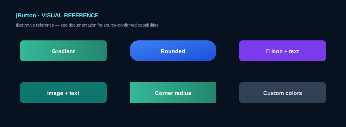
jButton is a jdashboardUI Custom View for B4J/JavaFX. The real source implements a gradient button with two styles, configurable corner radius, selection effect, and support for an image or icon next to the text.
The image above is a visual reference only. The capabilities documented here come from the real module.
Designer Properties
| Property | Type | Default | Purpose |
|---|---|---|---|
| TextColor | Color | 0xFFFFFFFF | Text color |
| Selectcolor | Boolean | True | Selection effect |
| ButtomType | String | 1 | Style 1 or 2 |
| MainText | String | Options | Text |
| TextSize | Int | 12 | 8–40 |
| cornerradius | Int | 5 | 0–100 |
| orientations | String | TOP_BOTTOM | Gradient direction |
| color1 | Color | #FF77777B | First color |
| color2 | Color | #FF4B4A4F | Second color |
Exposed orientations: TL_BR, TOP_BOTTOM, TR_BL, LEFT_RIGHT, RIGHT_LEFT, BR_TL, BOTTOM_TOP, RECTANGLE.
Click event
Private Sub BtnSave_Click
    Log("Click")
End Sub
This is the only public event declared by the module.
Create in code
Dim BtnSave As jButton
BtnSave.Initialize(Me, "BtnSave")
BtnSave.AddToParent(Root, 20dip, 20dip, 180dip, 48dip, _
    1, 14, "Save", xui.Color_White, _
    0xFF35B998, 0xFF23866F, _
    BtnSave.OrientationLEFT_RIGHT, 8)
AddToParent configures parent, position, size, style, text size/text/color, two background colors, orientation and corner radius.
Image and icon
BtnSave.ButtonSetImage(File.DirAssets, "save.png", 20, "LEFT")
BtnSave.ButtonSeticon(Chr(0xF0C7), xui.Color_White, fx.CreateFontAwesome(18), "LEFT")
Both APIs document LEFT, BOTTOM, RIGHT and TOP positions.
Public properties
BtnSave.Color1 = 0xFF35B998
BtnSave.Color2 = 0xFF23866F
BtnSave.TextSize = 16
BtnSave.Font = fx.CreateFont("Arial", 15, True, False)
All four are write-only. Public fields also include mBase, Tag, ColorEffectSelecting and orientation constants.
Public API
| Member | Purpose |
|---|---|
| Initialize | Initialize |
| DesignerCreateView | Custom View lifecycle |
| AddToParent | Create from code |
| ButtonSetImage | Add image |
| ButtonSeticon | Add icon |
| Color1 / Color2 | Gradient colors |
| TextSize / Font | Typography |
| Click | Click event |
Confirmed limitations
- No public
Textproperty for changing text after creation. - No component-specific public
Enabledproperty. - No public Hover, Pressed, Success, Warning or Danger APIs; those are visual styling ideas only.
- Hover/selection behavior is handled internally.
Base_Resizeis not exposed as public API.