
What OfficeColorPicker is
OfficeColorPicker is a B4J color selector inspired by the classic Microsoft Office palette.
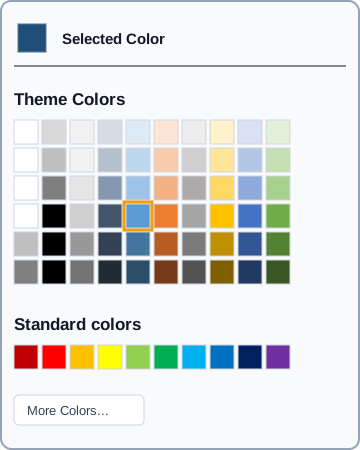
It is designed for quick selection from a familiar grid: selected-color preview, theme colors, light and dark variants, standard colors and an optional More Colors... button.
Unlike JColorPicker, which provides continuous HSV selection, alpha and hexadecimal editing, OfficeColorPicker uses a discrete Office-style palette. It is well suited to Ribbon UI, document editors, formatting tools and signature applications.
Control structure
OfficeColorPicker
├── Selected Color
├── Theme Colors
│   ├── 10 base colors
│   └── 6 variants per column
├── Standard colors
│   └── 10 standard colors
└── More Colors... (optional)
When a color box is clicked:
- SelectedColor is updated.
- The preview box changes.
- The selected box receives an orange border.
- ColorSelected is raised.
Dependencies
The actual module mainly uses:
- jFX;
- XUI;
- B4XView;
- JavaObject;
- janimations.
JavaObject handles JavaFX cursor and hover details. janimations provides the ripple feedback.
Designer usage
Add OfficeColorPicker as a Custom View in the Designer.
Assume it is named OfficeColorPicker1.
Private Sub OfficeColorPicker1_ColorSelected(Clr As Int)
    Log("Selected color: " & Clr)
End Sub
Read the current color with:
Dim Clr As Int = OfficeColorPicker1.SelectedColor
Complete example
Private Sub OfficeColorPicker1_ColorSelected(Clr As Int)
    pnlPreview.Color = Clr

    Dim HexColor As String
    HexColor = "#" & Bit.ToHexString(Clr).ToUpperCase

    Log("New color: " & HexColor)
End Sub

Private Sub OfficeColorPicker1_MoreClick(Clr As Int)
    Log("More colors requested. Current color: " & Clr)
End Sub
More Colors... does not automatically open another picker. It raises MoreClick so the application can decide what to show.
Integration with JColorPicker
A practical combination is:
- OfficeColorPicker for fast selection.
- JColorPicker for arbitrary custom colors.
Private Sub OfficeColorPicker1_MoreClick(Clr As Int)
    AdvancedColorPicker.SelectedColor = Clr
    AdvancedColorPicker.SetVisible(True)
End Sub
Create it from code
Private OfficePicker As OfficeColorPicker

Private Sub CreateOfficePicker
    OfficePicker.Initialize(Me, "OfficePicker")

    OfficePicker.ThemeTitle = "Theme Colors"
    OfficePicker.ButtonText = "More Colors..."
    OfficePicker.ShowMoreColors = True
    OfficePicker.TextColor = xui.Color_Black
    OfficePicker.BackgroundColor = xui.Color_White
    OfficePicker.SelectedColor = 0xFF4472C4

    OfficePicker.AddToParent(pnlColors, 296)
End Sub
Events:
Private Sub OfficePicker_ColorSelected(Clr As Int)
    Log(Clr)
End Sub

Private Sub OfficePicker_MoreClick(Clr As Int)
    Log("More colors: " & Clr)
End Sub
AddToParent
The public signature is:
AddToParent(Parent As B4XView, Width As Int)
The component creates its internal base, calculates its final height, adds itself to Parent and adjusts the container size to the calculated dimensions.
Events
ColorSelected
Private Sub OfficePicker_ColorSelected(Clr As Int)
    Log(Clr)
End Sub
Clr contains the selected B4X / ARGB color.
MoreClick
Private Sub OfficePicker_MoreClick(Clr As Int)
    Log(Clr)
End Sub
Clr contains the currently selected color.
SelectedColor
Set:
OfficePicker.SelectedColor = 0xFF5B9BD5
Read:
Dim Clr As Int = OfficePicker.SelectedColor
When the view already exists, the preview is updated immediately and the control tries to highlight a matching palette box.
Theme colors
The implementation uses ten base colors and generates six vertical variants for every column.
The actual factors are:
+0.8
+0.6
+0.4
 0
-0.25
-0.5
Positive values blend toward white. Negative values darken toward black.
Standard colors
The bottom row includes ten predefined colors: dark red, red, gold, yellow, light green, green, cyan, blue, dark blue and purple.
Hover and selection
Every color box uses JavaFX mouse-enter and mouse-exit events.
Hover uses an orange border. The selected box keeps a 2dip orange border while regular boxes use a thin gray border.
Selection also runs a ripple effect through janimations.
AutoFitWidth
OfficePicker.AutoFitWidth
AutoFitWidth estimates the required width from the longest title and rebuilds the interface. The minimum calculated width is 200.
Designer properties
| Property | Type | Default | Purpose |
|---|---|---|---|
| MainWidth | Int | 220 | Main width |
| ThemeTitle | String | Theme Colors | Theme section title |
| StdTitle | String | Standard colors | Standard section title |
| AutoTitle | String | Selected Color | Preview label |
| ButtonText | String | More Colors... | Bottom button text |
| ShowMoreColors | Boolean | True | Shows / hides the button |
| TextColor | Color | Black | Text color |
| FontSize | Int | 11 | General font size |
| SelectedColor | Color | Black | Initial selected color |
Runtime properties
OfficePicker.TextColor = xui.Color_DarkGray
OfficePicker.BackgroundColor = xui.Color_White
OfficePicker.FontSize = 12
OfficePicker.ThemeTitle = "Theme Colors"
OfficePicker.ButtonText = "More Colors..."
OfficePicker.ShowMoreColors = True
OfficePicker.SelectedColor = 0xFF4472C4
BackgroundColor updates immediately when the base exists. FontSize rebuilds the interface.
When using AddToParent, set ThemeTitle, ButtonText, ShowMoreColors and TextColor before AddToParent so the view is built with the desired values.
Public API
| Method / property | Purpose |
|---|---|
| Initialize(Callback, EventName) | Initializes the component |
| DesignerCreateView(...) | Designer integration |
| AddToParent(Parent, Width) | Creates it from code |
| AutoFitWidth | Fits width to section titles |
| SelectedColor | Gets / sets selected color |
| TextColor | Text color |
| BackgroundColor | Background color |
| FontSize | General font size |
| ThemeTitle | Theme section title |
| ButtonText | More Colors text |
| ShowMoreColors | Shows / hides More Colors |
| mBase | Component base view |
OfficeColorPicker vs JColorPicker
| Feature | OfficeColorPicker | JColorPicker |
|---|---|---|
| Picker type | Office palette | Continuous HSV |
| Quick predefined colors | Yes | Not its main purpose |
| Theme variants | Yes | Free selection |
| Alpha | No | Yes |
| Editable hexadecimal | No | Yes |
| More Colors | Integration event | Not required |
| Best for | Ribbon, documents, formatting, signatures | Any arbitrary color |
| AddToParent | Yes | Yes |
The controls are complementary rather than duplicates.
Recommended pattern
OfficePicker.Initialize(Me, "OfficePicker")
OfficePicker.SelectedColor = xui.Color_Blue
OfficePicker.AddToParent(pnlColorMenu, 296)

Private Sub OfficePicker_ColorSelected(Clr As Int)
    CurrentColor = Clr
    UpdatePreview
End Sub

Private Sub OfficePicker_MoreClick(Clr As Int)
    ShowAdvancedColorDialog(Clr)
End Sub